How to Work with Images in HTML – A Beginner's Guide

Images are an essential part of web development, adding visual appeal and context to your web pages.
In HTML, you can easily incorporate images to enhance the user experience. This article will guide you through the basics of working with images in HTML and help you understand images in HTML better.

How to Insert an Image into a Web Page
To display an image on your web page, you'll use the <img> element. It's a self-closing tag, which means you don't need a closing </img> tag. Instead, you place the image source and other attributes within the opening tag.
Here's the basic syntax:
- The src attribute specifies the image file's location.
- The alt attribute provides alternative text for screen readers and that's displayed if the image fails to load.

Image File Types
HTML supports various image file formats, including JPEG, PNG, GIF, and more. The choice of format depends on your needs.
Here are explanations of some commonly used image formats in HTML:
JPEG (Joint Photographic Experts Group):
- Best For: Photographs, images with gradients, and complex scenes.
- Advantages: High compression, small file sizes, and good image quality for photographs.
- Considerations: Lossy compression, not suitable for images with transparency.
PNG (Portable Network Graphics):
- Best For: Images with transparency, icons, logos, and graphics with sharp edges.
- Advantages: Supports both lossless and lossy compression, excellent image quality, and transparency.
- Considerations: Larger file sizes for complex images compared to JPEG.
GIF (Graphics Interchange Format):
- Best For: Simple animations, images with a limited color palette, and icons.
- Advantages: Supports animations, transparency, and small file sizes for simple graphics.
- Considerations: Limited color support (256 colors), not suitable for photographs or complex images.
SVG (Scalable Vector Graphics):
- Best For: Vector graphics, logos, icons, and images that need to scale without loss of quality.
- Advantages: Resolution-independent, small file sizes, and sharp rendering at any size.
- Considerations: Not suitable for complex photographic images.
- Best For: Modern web browsers and efficient image delivery.
- Advantages: Provides both lossy and lossless compression, smaller file sizes, and good image quality.
- Considerations: Limited support in older browsers.
BMP (Bitmap Image):
- Best For: Rarely used on the web due to large file sizes and lack of compression.
- Advantages: No loss of quality, suitable for certain specialized applications.
- Considerations: Large file sizes and not recommended for general web use.
When choosing an image format for your web page, consider factors such as the type of content, image complexity, required transparency, and your target audience's browser support.
It's common to use a combination of formats within a website to optimize image delivery. Using appropriate image compression techniques and tools can also help reduce file sizes while maintaining image quality, which is crucial for web performance.
Image Size and Scaling
You can control the size of your images using the width and height attributes. These attributes allow you to specify the dimensions of an image on your web page.

It's important to set appropriate dimensions to maintain aspect ratios and ensure responsive design.
Image Alignment
Aligning an image within the text using the align attribute is an approach that was once used in older versions of HTML. But the align attribute is deprecated in modern HTML (HTML5).
Instead, alignment is typically achieved through CSS. Here's an expanded explanation of both approaches:
How to use the deprecated align attribute (not recommended):
In older versions of HTML, you could use the align attribute with the <img> element to control the alignment of an image within text. The align attribute had values like "left," "right," "top," "middle," and "bottom." Here's an example:

This is some text that wraps around the image.
While this method worked in the past, it's considered outdated and is not recommended for modern web development. It's better to separate content from presentation by using CSS for alignment.
How to use CSS for image alignment (recommended):
In modern web development, CSS (Cascading Style Sheets) is the preferred way to control the alignment of images within text. You can apply CSS rules directly in your HTML file using inline styles or, preferably, use an external CSS file for better maintainability.
Here's an example of how you can use CSS to align an image to the left within a paragraph:
In this example, we define a CSS class called image-align-left that uses the float property to make the image float to the left of the text. The margin-right property adds some space between the image and the text to improve readability.
Using CSS for alignment provides more flexibility and control over the positioning of images within text, and it is the recommended approach for modern web design. It also separates styling from content, making your HTML cleaner and more maintainable.
Image Links
You can make images clickable by wrapping them in an <a> (anchor) element. You can further customize the behavior of the hyperlink by using additional HTML attributes, such as target="_blank" to open the linked page in a new browser tab or window.

Now, when a user clicks the image, it will navigate to the specified link.
Responsive Images
Modern websites need to be responsive, adapting to various screen sizes. To make your images responsive, use the max-width style property:
This property ensures that images will automatically scale down proportionally to fit the width of their parent containers when the screen size or viewport width decreases.
This is particularly important for ensuring that images don't overflow or break the layout on smaller screens, such as those on mobile devices.
How to Load Images from External Sources
You can also display images hosted on external websites by specifying the full URL in the src attribute:
Just make sure you have permission to use external images and that they are publicly accessible.
Image Accessibility
Web accessibility is crucial. Always include descriptive text in the alt attribute to assist users with disabilities. Meaningful alt text helps screen readers provide context for the image.
Alt text, short for "alternative text," is a textual description of an image that can be read aloud by screen readers or displayed in place of the image if it cannot be loaded.
Purpose of Alt Text:
- Screen Readers: People with visual impairments often use screen readers to navigate websites. When a screen reader encounters an image, it reads the alt text aloud to provide context and convey the image's meaning.
- Image Loading Issues: Alt text is also displayed when an image fails to load properly in a web browser, allowing users to understand the image's content even if they cannot see it.
How to Create Meaningful Alt Text:
- Alt text should be concise but descriptive, conveying the essential information or purpose of the image.
- It should be free from unnecessary details or visual design descriptions (for example, "A blue button" is not as helpful as "Submit Form").
- Avoid using phrases like "image of" or "picture of" since screen readers already announce that it's an image.
- For decorative or purely aesthetic images that don't convey information, use an empty alt attribute (alt="html image assignment") or indicate that it's decorative (alt="Decorative image").
Examples of Alt Text:
Example 1 (Informative Image):
Example 2 (Decorative Image):
Example 3 (Complex Image with Description):
Remember that the goal of alt text is to provide a meaningful and informative description of the image so that users with disabilities can understand its content and context.
By following these guidelines and creating appropriate alt text, you contribute to a more accessible and inclusive web experience for all users.
Additional Tips for Using Images
1. image optimization.
Optimizing images is crucial for web performance. Compress images, use appropriate dimensions, and select the right file format to balance image quality and loading speed.
2. Lazy Loading
You can improve website performance by implementing lazy loading. The "loading" attribute set to "lazy" is a feature in HTML that tells the browser to load the image lazily. This means it will only load the image when it's in or near the viewport (visible area) of the web page.
Lazy loading can help improve page loading performance by reducing the initial load time for images that are not immediately visible to the user.
Here's the code to do that:

3. Image Captioning
In addition to alt text for accessibility, consider using image captions for better context. You can include a <figcaption> element within a <figure> element:
4. Retina and High-DPI Displays
For high-DPI displays like Retina screens, serve higher-resolution images using the srcset attribute:
Incorporating images into an HTML documents is a fundamental skill for web developers. With the <img> element and its attributes, you can easily control image display, size, and alignment.
By following best practices for image optimization, accessibility, and responsive design, you'll create visually appealing and user-friendly web content.
As you continue your web development journey, practice integrating images into your projects and explore these additional tips to enhance the performance and accessibility of your websites.
frontend developer || technical writer
If you read this far, thank the author to show them you care. Say Thanks
Learn to code for free. freeCodeCamp's open source curriculum has helped more than 40,000 people get jobs as developers. Get started
HTML Online
Tips, tricks, tutorials…
How to align a HTML image to the center
Positioning and aligning images on an HTML page is crucial to layout the page. One of the most common questions is how to align an image to the center of a section. In this article we’re going to discuss many possible ways of placing images to the center.
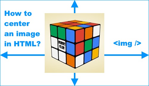
See the online demos and the source codes below. You can also open the developer tools of your web browser and inspect the elements.
In a paragraph
In the first example I’m going to present you how to position an image to the center of a container element, like a div, a paragraph or any other tag.

I used the text-align: center; CSS property to do the job. If you are familiar with the CSS code then this shouldn’t need more explanation.
With margins
We can assign margin: auto; style to a block element to center it. But we know that image tags are inline , not block elements so we have to assign a display: block; CSS style to make it work.

<center> tag
The <center> tag is obsolete which means that it’s no longer supported in HTML5 but it’s still supported by the web browsers like Google Chrome . This used to be a preferred method because it didn’t require style sheets, but plain HTML only. I don’t want to use outdated elements in my article so I’m not including a demo for this example.
align=middle tag attribute
Another obsolete method which didn’t require CSS, similar to the previous example. In older versions of HTML we could center an image assigning the align = “middle” tag attribute.
Align an image center vertically
We have discussed above how to align an image horizontally but there might be cases when you need to center it vertically. To accomplish this we have to take two steps. The wrapping element needs to be displayed as table cell and the vertical-align has to be set to middle . In my example I’m setting a fixed height to the container to make sure it’s higher than our picture.

Both horizontal and vertical centering
We can combine the horizontal and vertical alignment as demonstrated below.

I hope you’ve learned today something new reading this article and you are going to use them in your upcoming templates and designs .
Be a tech-savvy web developer/designer by migrating your web development/designing environment into the cloud to access it remotely from anywhere on any device(PC/Mac/android/iOS) with high performance hosted citrix xendesktop from CloudDesktopOnline at an affordable xendesktop cost . If you`re looking for a reliable cloud platform to fulfill your needs, Try out Azure managed services from Apps4Rent with 24*7*365 live tech-support.
- Skip to main content
- Select language
- Skip to search
- Images in HTML
Active learning: embedding an image
Active learning: creating a figure.
In the beginning, the Web was just text, and it was really quite boring. Fortunately, it wasn't too long before the ability to embed images (and other more interesting types of content) inside web pages was added. There are other types of multimedia to consider, but it is logical to start with the humble element represents an image in the document." href="../../../docs/Web/HTML/Element/img.html"> <img> element, used to embed a simple image in a webpage. In this article we'll look at how to use it in depth, including the basics, annotating it with captions using element represents self-contained content, frequently with a caption (<figcaption>), and is typically referenced as a single unit." href="../../../docs/Web/HTML/Element/figure.html"> <figure> , and detailing how it relates to CSS background images.
How do we put an image on a webpage?
In order to put a simple image on a webpage, we use the element represents an image in the document." href="../../../docs/Web/HTML/Element/img.html"> <img> element. This is an empty element (meaning that it has no text content or closing tag) that requires a minimum of one attribute to be useful — src (pronounced sarc , sometimes spoken as its full title, source ). The src attribute contains a path pointing to the image you want to embed in the page, which can be a relative or absolute URL, in the same way as element (or anchor element) creates a hyperlink to other web pages, files, locations within the same page, email addresses, or any other URL." href="../../../docs/HTML/Element/a.html"> <a> element href attribute values.
Note : You should read A quick primer on URLs and paths to refresh your memory on relative and absolute URLs before continuing.
So for example, if your image is called dinosaur.jpg , and it sat in the same directory as your HTML page, you could embed the image like so:
If the image was in an images subdirectory, which was inside the same directory as the HTML page (which Google recommends for SEO /indexing purposes), then you'd embed it like this:
Note : Search engines also read image filenames and count them towards SEO. Therefore, give your image a descriptive filename; dinosaur.jpg is better than img835.png .
You could embed the image using its absolute URL, for example:
But this is pointless, as it just makes the browser do more work, looking up the IP address from the DNS server all over again, etc. You'll almost always keep the images for your web site on the same server as your HTML.
Warning: Most images are copyrighted. Do not display an image on your webpage unless: 1) you own the image 2) you have received explicit, written permission from the image's owner, or 3) you have ample proof that the image is, in fact, in the public domain. Copyright violations are illegal and unethical. In addition, never point your src attribute at an image hosted on someone else's website that you don't have permission to link to. This is called "hotlinking". Again, stealing someone's bandwidth is illegal. It also slows down your page, leaving you with no control over whether the image is removed or replaced with something embarrassing.
Our above code would give us the following result:

Note : Elements like element represents an image in the document." href="../../../docs/Web/HTML/Element/img.html"> <img> and element to embed video content in a document." href="../../../docs/HTML/Element/video.html"> <video> are sometimes referred to as replaced elements . This is because the element's content ,and size, is defined by an external resource (like an image or video file), not by the contents of the element itself.
Note : You can find the finished example from this section running on Github (see the source code too.)
Alternative text
The next attribute we'll look at is alt . Its value is supposed to be a textual description of the image, for use in situations where the image cannot be seen/displayed. For example, our above code could be modified like so:
The easiest way to test your alt text is to purposely misspell your filename. If for example our image name was spelt dinosooooor.jpg , the browser wouldn't display the image, and display the alt text instead:

So, why would you ever see or need alt text? It can come in handy for a number of reasons:
- The user is visually impaired, and using a screen reader to read the web out to them. In fact, having alt text available to describe images is useful to most users.
- As described above, you might have spelt the file or path name wrong.
- The browser doesn't support the image type. Some people still use text-only browsers, such as Lynx , which alternatively displays the alt text of images.
- You may want to provide text for search engines to utilize. For example, search engines can match alt text with search queries.
- Users have turned off images to reduce data transfer volume and distractions. This is especially common on mobile phones, and in countries where bandwidth is limited and expensive.
What exactly should you write inside your alt attribute? It depends on why the image is there in the first place. In other words, what you lose if your image doesn't show up:
- Decoration. If the image is just decoration and isn't part of the content, add a blank alt="html image assignment". F or example, a screen reader doesn't waste time reading out content that is no core need to the user. Decorative images don't really belong in your HTML. CSS background images should be used for inserting decoration, but if it is unavoidable, alt="html image assignment" is the best way to go.
- Content. If your image provides significant information, provide the same information in a brief alt text. Or even better, in the main text which everybody can see. Don't write redundant alt text. How annoying would it be for a sighted user if all paragraphs were written twice in the main content? If the image is described adequately by the main text body, you can just use alt="html image assignment" .
- Link. If you put an image inside element (or anchor element) creates a hyperlink to other web pages, files, locations within the same page, email addresses, or any other URL." href="../../../docs/HTML/Element/a.html"> <a> tags, to turn an image into a link, you still must provide accessible link text . In such cases you may, either, write it inside the same <a> element, or inside the image's alt attribute. Whatever works best in your case.
- Text. You should not put your text into images. If your main heading needs a drop shadow, for example, use CSS for that rather than putting the text into an image. However, If you really can't avoid doing this , you should supply the text inside the alt attribute.
Essentially, the key is to deliver a usable experience, even when the images can't be seen. This ensures all users are not missing any of the content. Try turning off images in your browser and see how things look. You'll soon realise how unhelpful alt text is if the image cannot be seen, such as "logo" or "my favourite place".
Note : For more information, see our guide to Text Alternatives .
Width and height
You can use the width and height attributes, to specify the width and height of your image. You can find your image's width and height in a number of ways. For example on the Mac you can use Cmd + I to get the info display up for the image file. Returning to our example, we could do this:
This doesn't result in much difference to the display, under normal circumstances. But if the image isn't being displayed, for example, the user has just navigated to the page, and the image hasn't yet loaded, you'll notice the browser is leaving a space for the image to appear in:

This is a good thing to do, resulting in the page loading quicker and more smoothly.
However, you shouldn't alter the size of your images using HTML attributes. If you set the image size too big, you'll end up with images that look grainy,fuzzy, or too small, and wasting bandwidth downloading an image that is not fitting the user's needs. The image may also end up looking distorted, if you don't maintain the correct aspect ratio . You should use an image editor, to put your image at the correct size, before putting it on your webpage.
Note : If you do need to alter an image's size, you should use CSS instead.
Image titles
As with links , you can also add title attributes to images, to provide further supporting information if needed. In our example, we could do this:
This gives us a tooltip, just like link titles:

Image titles aren't essential to include. It is often better to include such supporting information in the main article text, rather than attached to the image. However, they are useful in some circumstances; for example, in an image gallery when you have no space for captions.
It is now your turn to play! This active learning section will have you up and running with a simple embedding exercise. You are provided with a basic element represents an image in the document." href="../../../docs/Web/HTML/Element/img.html"> <img> tag; we'd like you to embed the image located at the following URL:
https://raw.githubusercontent.com/mdn/learning-area/master/html/multimedia-and-embedding/images-in-html/dinosaur_small.jpg
Earlier we said to never hotlink to images on other servers, but this is just for learning purposes, so we'll let you off this one time.
We would also like you to:
- Add some alt text, and check that it works by misspelling the image URL.
- Set the image's correct width and height (hint; it is 200px wide and 171px high), then experiment with other values to see what the effect is.
- Set a title on the image.
If you make a mistake, you can always reset it using the Reset button. If you get really stuck, press the Show solution button to see an answer:
Playable code
Annotating images with figures and figure captions.
Speaking of captions, there are a number of ways that you could add a caption to go with your image. For example, there would be nothing to stop you doing this:
This is ok. It contains the content you need, and is nicely stylable using CSS. But there is a problem here: there is nothing that semantically links the image to its caption, which can cause problems for screen readers. For example, when you have 50 images and captions, which caption goes with which image?
A better solution, is to use the HTML5 element represents self-contained content, frequently with a caption (<figcaption>), and is typically referenced as a single unit." href="../../../docs/Web/HTML/Element/figure.html"> <figure> and element represents a caption or a legend associated with a figure or an illustration described by the rest of the data of the <figure> element which is its immediate ancestor." href="../../../docs/Web/HTML/Element/figcaption.html"> <figcaption> elements. These are created for exactly this purpose: to provide a semantic container for figures, and clearly linking the figure to the caption. Our above example, could be rewritten like this:
The element represents a caption or a legend associated with a figure or an illustration described by the rest of the data of the <figure> element which is its immediate ancestor." href="../../../docs/Web/HTML/Element/figcaption.html"> <figcaption> element tells browsers, and assistive technology, that the caption describes the other content of the element represents self-contained content, frequently with a caption (<figcaption>), and is typically referenced as a single unit." href="../../../docs/Web/HTML/Element/figure.html"> <figure> element.
Note : From an accessibility viewpoint, captions and alt text have distinct roles. Captions benefit even people who can see the image, whereas alt text provides the same functionality as an absent image. Therefore, captions and alt text shouldn't just say the same thing, because they both appear when the image is gone. Try turning images off in your browser and see how it looks.
A figure doesn't have to be an image. It is an independent unit of content that:
- Expresses your meaning in a compact, easy-to-grasp way.
- Could go in several places in the page's linear flow.
- Provides essential information supporting the main text.
A figure could be several images, a code snippet, audio, video, equations, a table, or something else.
In this active learning section, we'd like you to take the finished code from the previous active learning section, and turn it into a figure:
- Wrap it in a element represents self-contained content, frequently with a caption (<figcaption>), and is typically referenced as a single unit." href="../../../docs/Web/HTML/Element/figure.html"> <figure> element.
- Copy the text out of the title attribute, remove the title attribute, and put the text inside a element represents a caption or a legend associated with a figure or an illustration described by the rest of the data of the <figure> element which is its immediate ancestor." href="../../../docs/Web/HTML/Element/figcaption.html"> <figcaption> element below the image.
Playable code 2
Css background images.
You can also use CSS to embed images into webpages (and JavaScript, but that's another story entirely). The CSS background-image property, and the other background-* properties, are used to control background image placement. For example, to place a background image on every paragraph on a page, you could do this:
The resulting embedded image, is arguably easier to position and control than HTML images. So why bother with HTML images? As hinted to above, CSS background images are for decoration only. If you just want to add something pretty to your page to enhance the visuals, this is fine. Though, such images have no semantic meaning at all. They can't have any text equivalents, are invisible to screen readers, etc. This is HTML images time to shine!
Summing up: if an image has meaning, in terms of your content, you should use an HTML image. If an image is purely decoration, you should use CSS background images.
Note : You'll learn a lot more about CSS background images in our CSS topic.
That's all for now. We have covered images and captions in detail. In the next article we'll move it up a gear, looking at how to use HTML to embed video and audio in web pages.
Document Tags and Contributors
- Complete beginners start here!
- Getting started with the Web overview
- Installing basic software
- What will your website look like?
- Dealing with files
- HTML basics
- JavaScript basics
- Publishing your website
- How the Web works
- HTML — Structuring the Web
- Introduction to HTML overview
- Getting started with HTML
- What's in the head? Metadata in HTML
- HTML text fundamentals
- Creating hyperlinks
- Advanced text formatting
- Document and website structure
- Debugging HTML
- Assessment: Marking up a letter
- Assessment: Structuring a page of content
- Multimedia and embedding overview
- Video and audio content
- From object to iframe — other embedding technologies
- Adding vector graphics to the Web
- Responsive images
- Assessment: Mozilla splash page
- HTML tables overview
- HTML table basics
- HTML Table advanced features and accessibility
- Assessment: Structuring planet data
- CSS — Styling the Web
- Introduction to CSS overview
- How CSS works
- Selectors introduction
- Simple selectors
- Attribute selectors
- Pseudo-classes and pseudo-elements
- Combinators and multiple selectors
- CSS values and units
- Cascade and inheritance
- The box model
- Debugging CSS
- Assessment: Fundamental CSS comprehension
- Styling text overview
- Fundamental text and font styling
- Styling lists
- Styling links
- Assessment: Typesetting a community school homepage
- Styling boxes overview
- Box model recap
- Backgrounds
- Styling tables
- Advanced box effects
- Assessment: Creating fancy letterheaded paper
- Assessment: A cool-looking box
- CSS layout overview
- Introduction
- Positioning
- Practical positioning examples
- JavaScript — Dynamic client-side scripting
- JavaScript first steps overview
- What is JavaScript?
- A first splash into JavaScript
- What went wrong? Troubleshooting JavaScript
- Storing the information you need — Variables
- Basic in JavaScript — Numbers and operators
- Handling text — Strings in JavaScript
- Useful string methods
- Assessment: Silly story generator
- JavaScript building blocks overview
- Making decisions in your code — Conditionals
- Looping code
- Functions — Reusable blocks of code
- Build your own function
- Function return values
- Introduction to events
- Assessment: Image gallery
- Introducing JavaScript objects overview
- Object basics
- Object-oriented JavaScript for beginners
- Object prototypes
- Inheritance in JavaScript
- Working with JSON data
- Object building practise
- Assessment: Adding features to our bouncing balls demo
- Accessibility — Make the web usable by everyone
- Accessibility overview
- What is accessibility?
- HTML: A good basis for accessibility
- CSS and JavaScript accessibility best practices
- WAI-ARIA basics
- Accessible multimedia
- Mobile accessibility
- Assessment: Accessibility troubleshooting
- Tools and testing
- Cross browser testing overview
- Introduction to cross browser testing
- Strategies for carrying out testing
- Handling common HTML and CSS problems
- Handling common JavaScript problems
- Handling common accessibility problems
- Implementing feature detection
- Introduction to automated testing
- Setting up your own test automation environment
- Server-side website programming
- First steps overview
- Introduction to the server-side
- Client-Server overview
- Server-side web frameworks
- Website security
- Django web framework (Python) overview
- Setting up a development environment
- Tutorial: The Local Library website
- Tutorial Part 2: Creating a skeleton website
- Tutorial Part 3: Using models
- Tutorial Part 4: Django admin site
- Tutorial Part 5: Creating our home page
- Tutorial Part 6: Generic list and detail views
- Tutorial Part 7: Sessions framework
- Tutorial Part 8: User authentication and permissions
- Tutorial Part 9: Working with forms
- Tutorial Part 10: Testing a Django web application
- Tutorial Part 11: Deploying Django to production
- Web application security
- Assessment: DIY mini blog
- Express Web Framework (Node.js/JavaScript) overview
- Express/Node introduction
- Setting up a Node (Express) development environment
- Express tutorial: The Local Library website
- Express Tutorial Part 2: Creating a skeleton website
- Express Tutorial Part 3: Using a database (with Mongoose)
- Express Tutorial Part 4: Routes and controllers
- Express Tutorial Part 5: Displaying library data
- Express Tutorial Part 6: Working with forms
- Express Tutorial Part 7: Deploying to production
- Further resources
- WebGL: Graphics processing
- HTML questions
- CSS questions
- JavaScript questions
- Tools and setup
- Design and accessibility
- How to contribute
A Guide to the Responsive Images Syntax in HTML
, plus a whole bunch of things to consider to help you get the best performance and design control from your images.
This guide is about the HTML syntax for responsive images (and a little bit of CSS for good measure). The responsive images syntax is about serving one image from multiple options based on rules and circumstances. There are two forms of responsive images, and they’re for two different things:
If your only goal is…
Increased Performance
Then what you need is…
There is a lot of performance gain to be had by using responsive images. Image weight has a huge impact on pages’ overall performance , and responsive images are one of the best things that you can do to cut image weight. Imagine the browser being able to choose between a 300×300 image or a 600×600. If the browser only needs the 300×300, that’s potentially a 4× bytes-over-the-wire savings! Savings generally go up as the display resolution and viewport size go down; on the smallest screens, a couple of case studies have shown byte savings of 70–90%.
If you also need…
Design Control
Another perfectly legit goal with responsive images is not just to serve different sizes of the same image, but to serve different images . For example, cropping an image differently depending on the size of the screen and differences in the layout. This is referred to as “art direction.”
The <picture> element is also used for fallback image types and any other sort of media query switching (e.g. different images for dark mode). You get greater control of what browsers display.
There is a lot to talk about here, so let’s go through both syntaxes, all of the related attributes and values, and talk about a few related subjects along the way, like tooling and browsers.
Table of Contents
Using srcset, using <picture>, where do you get the differently-sized images, automated responsive images, related concepts, what about responsive images in css with background images, do you need to polyfill, other important image considerations, other good resources.
- Browser support
The <img srcset="" src="" alt="html image assignment"> syntax is for serving differently-sized versions of the same image. You could try to serve entirely different images using this syntax, but browsers assume that everything in a srcset is visually-identical and will choose whichever size they think is best, in impossible-for-you-to-predict ways. So I wouldn’t recommend it.
Perhaps the easiest-possible responsive images syntax is adding a srcset attribute with x descriptors on the images to label them for use on displays with different pixel-densities.
Here, we’ve made the default (the src ) the “low res” (1×) copy of the image. Defaulting to the smallest/fastest resources is usually the smart choice. We also provide a 2× version. If the browser knows it is on a higher pixel-density display (the 2x part), it will use that image instead.

You can do as many pixel-density variants as you like.
While this is cool and useful, x descriptors only account for a small percentage of responsive images usage . Why? They only let browsers adapt based on one thing: display pixel-density. A lot of times, though, our responsive images are on responsive layouts, and the image’s layout size is shrinking and stretching right along with the viewport. In those situations, the browser needs to make decisions based on two things: the pixel-density of the screen, and the layout size of the image. That’s where w descriptors and the sizes attribute come in, which we’ll look at in the next section.
Using srcset / w + sizes
This is the good stuff. This accounts for around 85% of responsive images usage on the web. We’re still serving the same image at multiple sizes, only we’re giving the browser more information so that it can adapt based on both pixel-density and layout size.
We’re still providing multiple copies of the same image and letting the browser pick the most appropriate one. But instead of labeling them with a pixel density ( x ) we’re labelling them with their resource width, using w descriptors . So if baby-s.jpg is 300×450, we label it as 300w .
Using srcset with width ( w ) descriptors like this means that it will need to be paired with the sizes attribute so that the browser will know how large of a space the image will be displaying in. Without this information, browsers can’t make smart choices.

Creating accurate sizes
Creating sizes attributes can get tricky. The sizes attribute describes the width that the image will display within the layout of your specific site , meaning it is closely tied to your CSS. The width that images render at is layout-dependent rather than just viewport dependent!
Let’s take a look at a fairly simple layout with three breakpoints. Here’s a video demonstrating this:
The breakpoints are expressed with media queries in CSS:
The image is sized differently at each breakpoint. Here’s a breakdown of all of the bits and pieces that affect the image’s layout width at the largest breakpoint (when the viewport is wider than 700px):

- At the largest size: there is 9rem of explicit spacing, so the image is calc(100vw - 9rem - 200px) wide. If that column used a fr unit instead of 200px , we’d kinda be screwed here.
- At the medium size: the sidebar is dropped below, so there is less spacing to consider. Still, we can do calc(100vw - 6rem) to account for the margins and padding.
- At the smallest size: the body margin is removed, so just calc(100vw - 2rem) will do the trick.
Phew! To be honest, I found that a little challenging to think out, and made a bunch of mistakes as I was creating this. In the end, I had this:
A sizes attribute that gives the browser the width of the image across all three breakpoints, factoring in the layout grid, and all of the surrounding gap , margin , and padding that end up impacting the image’s width.
Now wait! Drumroll! 🥁🥁🥁 That’s still wrong. I don’t understand why exactly, because to me that looks like it 100% describes what is happening in the CSS layout. But it’s wrong because Martin Auswöger’s RespImageLint says so. Running that tool over the isolated demo reports no problems except the fact that the sizes attribute is wrong for some viewport sizes, and should be:
I don’t know how that’s calculated and it’s entirely unmaintainable by hand, but, it’s accurate. Martin’s tool programmatically resizes the page a bunch and writes out a sizes attribute that describes the actual, observed width of the image over a wide range of viewport sizes. It’s computers, doing math, so it’s right. So, if you want a super-accurate sizes attribute, I’d recommend just putting a wrong one on at first, running this tool, and copying out the correct one.
For an even deeper dive into all this, check out Eric Portis’ w descriptors and sizes : Under the hood .
Being more chill about sizes
Another option is use the Horseshoes & Hand Grenades Method™ of sizes (or, in other words, close counts). This comes highly suggested .
For example, sizes="96vw" says, “This image is going to be pretty big on the page — almost the full width — but there will always be a little padding around the edges, so not quite. Or sizes="(min-width: 1000px) 33vw, 96vw" says, “This image is in a three-column layout on large screens and close to full-width otherwise.” Practicality-wise, this can be a sane solution.
You might find that some automated responsive image solutions, which have no way of knowing your layout, make a guess — something like sizes="(max-width: 1000px) 100vw, 1000px" . This is just saying, “Hey we don’t really know much about this layout, but we’re gonna take a stab and say, worst case, the image is full-width, and let’s hope it never renders larger than 1000px”.
Abstracting sizes
I’m sure you can imagine how easy it is to not only get sizes wrong, but also have it become wrong over time as layouts change on your site. It may be smart for you to abstract it using a templating language or content filter so that you can change the value across all of your images more easily.
I’m essentially talking about setting a sizes value in a variable once, and using that variable in a bunch of different <img> elements across your site. Native HTML doesn’t offer that, but any back end language does; for instance, PHP constants , Rails config variables , the React context API used for a global state variable, or variables within a templating language like Liquid can all be used to abstract sizes .
“Browser’s choice”
Now that we have a sizes attribute in place, the browser knows what size (or close to it) the image will render at and can work its magic . That is, it can do some math that factors in the pixel density of the screen, and the size that the image will render at, then pick the most appropriately-sized image.
The math is fairly straightforward at first. Say you’re about to show an image that is 40vw wide on a viewport that is 1200px wide, on a 2x pixel-density screen. The perfect image would be 960 pixels wide, so the browser is going to look for the closest thing it’s got. The browser will always calculate a target size that it would prefer based on the viewport and pixel-density situations, and what it knows from sizes , and compare that target to what it’s got to pick from in srcset . How browsers do the picking, though, can get a little weird.
A browser might factor more things into this equation if it chooses to. For example, it could consider the user’s current network speeds, or whether or not the user has flipped on some sort of “data saver” preference. I’m not sure if any browsers actually do this sort of thing, but they are free to if they wish as that’s how the spec was written . What some browsers sometimes choose to do is pull from cache. If the math shows they should be using a 300px image, but they already have a 600px in local cache, they will just use that. Smart. Room for this sort of thing is a strength of the srcset / sizes syntax. It’s also why you always use different sizes of the same image, within srcset : you’ve got no way to know which image is going to be selected. It’s the browser’s choice .
This is weird. Doesn’t the browser already know this stuff?
You might be thinking, “Uhm why do I have to tell the browser how big the image will render, doesn’t it know that?” Well, it does, but only after it’s downloaded your HTML and CSS and laid everything out. The sizes attribute is about speed. It gives the browser enough information to make a smart choice as soon as it sees your <img> .
Now you might be thinking, “But what about lazy-loaded images?” (as in, by the time a lazy-loaded image is requested, layout’s already been done and the browser already knows the image’s render size). Well, good thinking! Alexander Farkas’ lazysizes library writes out sizes attributes automatically on lazyload, and there’s an ongoing discussion about how to do auto- sizes for lazy-loaded images, natively.
sizes can be bigger than the viewport
Quick note on sizes . Say you have an effect on your site so that an image “zooms in” when it’s clicked. Maybe it expands to fill the whole viewport, or maybe it zooms even more, so that you can see more detail. In the past, we might have had to swap out the src on click in order to switch to a higher-res version. But now, assuming a higher-res source is already in the srcset , you can just change the sizes attribute to something huge, like 200vw or 300vw , and the browser should download the super-high-res source automatically for you. Here’s an article by Scott Jehl on this technique.
↩️ Back to top
Hopefully, we’ve beaten it into the ground that <img srcset="" sizes="" alt="html image assignment"> is for serving differently-sized versions of the same image . The <picture> syntax can do that too, but the difference here is that the browser must respect the rules that you set. That’s useful when you want to change more than just the resolution of the loaded image to fit the user’s situation. This intentional changing of the image is usually called “art direction.”
Art Direction
This code block is an example of what it might look like to have three stages of an “art directed” image.
- On large screens, show a zoomed-out photo.
- On medium screens, show that same photo, zoomed in a bit.
- On small screens, zoom in even more.
The browser must respect our media queries and will swap images at our exact breakpoints. That way, we can be absolutely sure that nobody on a small screen will see a tiny, zoomed-out image, which might not have the same impact as one of the zoomed-in versions.
Here’s a demo, written in Pug to abstract out some of the repetitive nature of <picture> .
Art direction can do a lot more than just cropping
Although cropping and zooming like this is the most common form of art direction by far, you can do a lot more with it. For instance, you can:
- Dark-ify™ images for users in dark mode,
- avoid sending animated GIFs to users with a “prefers reduced motion” accessibility preference,
- re-arrange image content so that it all fits “above the fold” on short viewports,
- set a maximum resolution cap , to save users on 3×-plus devices a lot of bytes,
- send static, high-res, monochrome images to printers and e-ink devices.
Sky’s the limit, really.
Combining source and srcset
Because <source> also uses the srcset syntax, they can be combined. This means that you can still reap the performance benefits of srcset even while swapping out visually-different images with <source> . It gets pretty verbose though!
The more variations you create and the more resized versions you create per variation, the more verbose this code has to get.
Fallbacks for modern image formats
The <picture> element is uniquely suited to being able to handle “fallbacks.” That is, images in cutting-edge formats that not all browsers might be able to handle, with alternative formats for browsers that can’t load the preferred, fancy one. For example, let’s say you want to use an image in the WebP format. It’s a pretty great image format, often being the most performant choice, and it’s supported everywhere that the <picture> element is, except Safari. You can handle that situation yourself, like:
This succeeds in serving a WebP image to browsers that support it, and falls back to a JPEG image, which is definitely supported by all browsers.
Here’s an example of a photograph (of me) at the exact same size where the WebP version is about 10% (!!!) of the size of the JPEG.
How do you create a WebP image? Well, it’s more of a pain in the butt than you’d like it to be, that’s for sure. There are online converters , command line tools , and some modern design software, like Sketch, helps you export in that format. My preference is to use an image hosting CDN service that automatically sends images in the perfect format for the requesting browser, which makes all this unnecessary (because you can just use img / srcset ).
WebP isn’t the only player like this. Safari doesn’t support WebP, but does support a format called JPG 2000 which has some advantages over JPEG. Internet Explorer 11 happens to support an image format called JPEG-XR which has different advantages. So to hit all three, that could look like:
This syntax (borrowed form a blog post by Josh Comeau ) supports all three of the “next-gen” image formats in one go. IE 11 doesn’t support the <picture> syntax, but it doesn’t matter because it will get the <img> fallback which is in the JPEG-XR format it understands.
Estelle Weyl also covered this idea in a 2016 blog post on image optimization .
You can make them yourself. Heck, even the free Preview app on my Mac can resize an image and “Save As.”

But that’s work. It’s more likely that the creation of variations of these images is automated somehow (see the section below) or you use a service that allows you to create variations just by manipulating the URL to the image. That’s a super common feature of any image hosting/image CDN service. To name a few:
- Cloudinary offers it
- Netlify offers it
- imgix offers it
- Image Optim offers it
- Filestack offers it
- Cloudflare offers it
Not only do these services offer on-the-fly image resizing, they also often offer additional stuff, like cropping, filtering, adding text, and all kinds of useful features, not to mention serving assets efficiently from a CDN and automatically in next-gen formats. That makes them a really strong choice for just about any website, I’d say.
Here’s Glen Maddern in a really great screencast talking about how useful Image CDNs can be:
Design software is becoming more aware that we often need multiple copies of images. For example, the exporting interface from Figma is pretty nice, where any given selection can be exported. It allows multiple exports at once (in different sizes and formats) and remembers what you did the last time you exported.

The syntax of responsive images is complex to the point that doing it by hand is often out of the question. I’d highly recommend automating and abstracting as much of this away as possible. Fortunately, a lot of tooling that helps you build websites knows this and includes some sort of support for it. I think that’s great because that’s what software should be doing for us, particularly when it is something that is entirely programmatic and can be done better by code than by humans. Here are some examples…
- Cloudinary has this responsive breakpoints tool including an API for generating the perfect breakpoints.
- WordPress generates multiple versions of images and outputs in the responsive images syntax by default .
- Gatsby has a grab-bag of plugins for transforming and implementing images on your site. You ultimately implement them with gatsby-image , which is a whole fancy thing for implementing responsive images and other image loading optimizations. Speaking of React, it has component abstractions like “An Almost Ideal React Image Component” that also does cool stuff.
- Nicolas Hoizey’s Images Responsiver Node module (and it’s Eleventy plugin ) makes a ton of smart markup choices for you, and pairs nicely with a CDN that can handle the on-the-fly resizing bits.
- These are just a few examples! Literally anything you can do to make this process easier or automatic is worth doing.

I’m sure there are many more CMSs and other software products that help automate away the complexities of creating the responsive images syntax. While I love that all this syntax exists, I find it all entirely too cumbersome to author by hand. Still, I think it’s worth knowing all this syntax so that we can build our own abstractions, or check in on the abstractions we’re using to make sure they are doing things correctly.
- The object-fit property in CSS controls how an image will behave in its own box. For example, an image will normally “squish” if you change the dimensions to something different than its natural aspect ratio, but object-fit can be used to crop it or contain it instead.
- The object-position property in CSS allows you to nudge an image around within its box.
We’ve covered exactly this before. The trick is to use @media queries to change the background-image source. For example:
With this CSS syntax, depending on the browser conditions, the browser will only download one of the two images, which achieves the same performance goal that the responsive images syntax in HTML does. If it helps, think of the above as the CSS equivalent of the <picture> syntax: the browser must follow your rules and display what matches.
If you’re looking to let the browser choose the best option , like srcset / sizes , but in CSS, the solution is ultimately going to be the image-set() function . There’s two problems with image-set() , today, though:
- Support for it isn’t there yet. Safari’s implementation leads the pack, but image-set() has been prefixed in Chrome for eight years, and it’s not there at all in Firefox.
- Even the spec itself seems behind the times. For example, it only supports x descriptors (no w , yet ).
Best to just use media queries for now.
I’m pretty meh on pollyfilling any of this right this moment. There is a great polyfill though, called Picturefill , which will buy you full IE 9-11 support if you need that. Remember, though, that none of this stuff breaks to the point of not displaying any image at all in non-supporting browsers, assuming you have an <img src="" alt="html image assignment"> in there somewhere. If you make the (fairly safe) assumption that IE 11 is running on a low-pixel-density desktop display, you can make your image sources reflect that by default and build out from there.
- Optimizing quality: The point of responsive images is loading the smallest, most impactful resource that you can. You can’t achieve that without effectively compressing your image. You’re aiming for a “sweet spot” for every image, between looking good and being light. I like to let image hosting services solve this problem for me, but Etsy has a really great writeup of what they’ve been able to accomplish with infrastructure that they built themselves.
- Serving from CDNs: Speaking of image hosting services, speed comes in many forms. Fast servers that are geographically close to the user are an important speed factor as well.
- Caching: What’s better than loading less data over the network? Loading no data at all! That’s what HTTP caching is for. Using the Cache-Control header, you can tell the browser to hang on to images so that if the same image is needed again, the browser doesn’t have to go over the network to get it, which is a massive performance boost for repeat viewings.
- Lazy loading: This is another way to avoid loading images entirely. Lazy loading means waiting to download an image until it is in or near the viewport. So, for example, an image way far down the page won’t load if the user never scrolls there.
(That I haven’t linked up in the post already!)
- Eric Portis on the Cloudinary blog: Responsive images with ‘srcset’, ‘sizes’ and Cloudinary
- Eric Portis’ deep dive into Srcset and sizes
- Eric Portis on Smashing Magazine: Responsive Images Done Right: A Guide To <picture> And srcset
- MDN Guide: Responsive images
- Jason Grigsby’s big 10-part guide on the Cloudfour blog
- Scott Vandehey on the Cloudfour blog: Responsive Images the Simple Way
- The original W3C Community Group that fought for responsive images in browsers and got it done
- Pete LePage on the Google Developer Web Fundamentals Guide: Images
- Addy Osmani’s Essential Image Optimization eBook
- Elad Shechter’s Complete Guide to Responsive Images
- 📹 Mat Marquis’ conference talk: The Past, Present, and Future of Responsive Images
- Mat Marquis’ book Image Performance
- Jake Archibald’s The anatomy of responsive images
- 📹 Responsive Images, WordPress, and Cloudinary
- Andreas Bovens on Opera’s Developer Blog: Responsive Images: Use Cases and Documented Code Snippets to Get You Started
Browser Support
This is for srcset / sizes , but it’s the same for <picture> .
This browser support data is from Caniuse , which has more detail. A number indicates that browser supports the feature at that version and up.
Mobile / Tablet
Is it just me or is this just too complicated for many images? Why not talk about how to keep things easy? Why not question whether so much markup and tooling is necessary? Must everyone of us now uses tooling for every tag? We don’t work for Google or Facebook. There are many many many of us who say no!
I like the guidelines from Jen Meiert for example. Then you can still use img. Of course! When it makes sense. Why are perspectives like this missing? I think this guide here is fine but it’s not complete if all it says is use more HTML.
If ultimate payload differences are insignificant, just use img. If payload differences are moderate or if no tooling is available, use img@srcet. If payload differences are large and tooling is available, use picture and source along with alternative image formats (like WebP) to achieve maximum performance.
I try to make the point many times in the article that automation is vitally important here. I would never advocate that you author this by hand every time. Personally, I hardly ever do that. I’m always looking for ways to abstract and automate it. Quote from the article:
I’d highly recommend automating and abstracting as much of this away as possible.
But I also advocate for understanding how it works. This article is about understanding how it works and having a reference to check against when you need to check the syntax and understand what is happening.
I think it’s worth knowing all this syntax so that we can build our own abstractions, or check in on the abstractions we’re using to make sure they are doing things correctly.
Thank you for replying. When would you give your approval to use img and only img? Or do I misunderstand and that is still fine from your point of view?
image-set() has been prefixed in Chrome for eight years
What’s the holdup on the support for image-set() ?! The @media solution works (I’m using it on a high-volume site) but it’s clunky and verbose.
We ended up with a Sass mixin for it. The basic idea is checking for @support for image-set() and falling back to media queries.
Thanks for this, Chris! And because it’s not explicitly mentioned, am I right in saying:
We can combine the srcset and sizes approach with the addition of width and height HTML attributes on our img , so we get the added benefit of improving performance and preventing layout jank too?
(The specific dimensions we provide in our width and height aren’t important as long as they represent the required aspect ratio, since all images in our srcset should share a common aspect ratio anyway.)
My understanding is that this update is coming soon in Firefox and Chrome (if not already released).
AFAIK there’s no similar solution at present for the Art Direction use case.
So where do the “modern image formats (JPEG 2000, JPEG XR, and WebP)” fit into this fuster cluck. How much code must we write to insert a single image?This is getting ridiculous! I’d like to keep all my website on one server but that’s begining to sound impossible.
OK, talk to me like I’m an idiot. What’s the difference between srcset and data-srcset ?
HTML Images
In this tutorial you will learn how to include images in an HTML document.
Inserting Images into Web Pages
Images enhance visual appearance of the web pages by making them more interesting and colorful.
The <img> tag is used to insert images in the HTML documents. It is an empty element and contains attributes only. The syntax of the <img> tag can be given with:
The following example inserts three images on the web page:
Each image must carry at least two attributes: the src attribute, and an alt attribute.
The src attribute tells the browser where to find the image. Its value is the URL of the image file.
Whereas, the alt attribute provides an alternative text for the image, if it is unavailable or cannot be displayed for some reason. Its value should be a meaningful substitute for the image.
Note: Like <br> , the <img> element is also an empty element , and does not have a closing tag. However, in XHTML it closes itself ending with " /> ".
Tip: The required alt attribute provides alternative text description for an image if a user for some reason cannot able to view it because of slow connection, image is not available at the specified URL, or if the user uses a screen reader or non-graphical browser.
Setting the Width and Height of an Image
The width and height attributes are used to specify the width and height of an image.
The values of these attributes are interpreted in pixels by default.
You can also use the style attribute to specify width and height for the images. It prevents style sheets from changing the image size accidently, since inline style has the highest priority.
Note: It's a good practice to specify both the width and height attributes for an image, so that browser can allocate that much of space for the image before it is downloaded. Otherwise, image loading may cause distortion or flicker in your website layout.
Using the HTML5 Picture Element
Sometimes, scaling an image up or down to fit different devices (or screen sizes) doesn't work as expected. Also, reducing the image dimension using the width and height attribute or property doesn't reduce the original file size. To address these problems HTML5 has introduced the <picture> tag that allows you to define multiple versions of an image to target different types of devices.
The <picture> element contains zero or more <source> elements, each referring to different image source, and one <img> element at the end. Also each <source> element has the media attribute which specifies a media condition (similar to the media query) that is used by the browser to determine when a particular source should be used. Let's try out an example:
Note: The browser will evaluate each child <source> element and choose the best match among them; if no matches are found, the URL of the <img> element's src attribute is used. Also, the <img> tag must be specified as the last child of the <picture> element.
Working with Image Maps
An image map allows you to define hotspots on an image that acts just like a hyperlink .
The basic idea behind creating image map is to provide an easy way of linking various parts of an image without dividing it into separate image files. For example, a map of the world may have each country hyperlinked to further information about that country.
Let's try out a simple example to understand how it actually works:
The name attribute of the <map> tag is used to reference the map from the <img> tag using its usemap attribute. The <area> tag is used inside the <map> element to define the clickable areas on an image. You can define any number of clickable areas within an image.
Note: The image map should not be used for website navigation. They are not search engine friendly. A valid use of an image map is with a geographical map.
Tip: There are many online tools available for creating image maps. Some advanced editors like Adobe Dreamweaver also provides a set of tools for easily creating image maps.

Is this website helpful to you? Please give us a like , or share your feedback to help us improve . Connect with us on Facebook and Twitter for the latest updates.
Interactive Tools

Linking Image in HTML: How to create links from images
- By Steve Founder of PageDart
We are going to take a beginner friendly look at how to create image links on your website.
We will look at which HTML tags you need to use in the code.
If you have never done this before, don't worry! I will guide you through the whole process.
By the end of this article, you will be creating image links all over your web page and the Internet.
We are also going to look at some more advanced techniques towards the end of the article if you are feeling brave.
Grab a coffee, let's dive in!
How do you Create a Hyperlink?
To get links on your home page you need to create a hyperlink. To do this in HTML you need to use an <a> tag. Each <a> tag has two parts the opening and closing tag.
Here is an example:
In the above, you can see that the open tag:
<a href="...">
Creates the start of the hyperlink. Then we close the tag with:
Any text that we write between the open and close tag is your link text. For Example:
To turn this into a link we need to add a URL. To do this we add the URL to the href attribute. The URL can point to anywhere on the internet. For this example we are going to use the PageDart homepage:
Make sure to include the full URL with HTTPS at the front.
That is all there is to create a text-only link in HTML. Next, let's look at how we can add an image to a web page using HTML.
How do you Create an image in HTML?
To add an image to your web page use an img tag.
This tag is a bit different from an a tag in that it does not have an opening and closing tag.
To create an img tag you need to give the tag a source file. Use the src attribute to do this:
This will add an image to the screen like this:
Now we have an image we need to turn it into a link. To do that we need to add a <img> tag inside the <a> tags creating a linking image in HTML.
Let's look at an example next.
Image as a link
To turn an image into a link you need to add the <img> tag inside the <a> tag. So taking our earlier example the source code would look like this:
Which would produce this HTML:
By adding the <img> tag inside an <a> tag the browser can see that the image should be clickable. You have turned the image into a link!
If you are using WordPress then you can add this HTML code to your page using the text view in the page editor.
You can also add text and images inside the link, let's look at this.
Image and Text as a Link
The example above showed how to add only an image as the link.
What if we wanted to add both an image and text to a link.
Well, in this case, we need to make sure that we add the text before we close the <a> tag:
In the above, we have added “PageDart Home” inside the <a> tag along with the <img> tag. When shown in a web browser on the page it will look like this:
There is one more attribute on the <img> tag that we have not discussed and you should be using.
It is the alt attribute.
Image Links and the Alt Attribute
Images on the internet should have an alt attribute. This is a text description of the image.
Screen readers use the alt text to help visually impaired users. The screen readers will read out the text description when it finds an image.
To do this we add an alt attribute to the img tag like this:
Now when the screen reader reads this image it will say “PageDart.com” out loud.
It is important to follow best practices when writing image alt text .
Make sure you think about the person who is using the screen reader. Write your alt text description for them and describe the image as best you can.
This is all you need to create linking images in HTML. Yet, there are a few more advanced techniques that you can use. If you are feeling brave we will look at these next.
Advanced Technique: Image as a Link using CSS
A more advanced technique is to use CSS. CSS stands for Cascading Style Sheet and it allows you to change how a HTML page looks.
With CSS you can set a background image on an element such as our <a> tag.
Here we would have HTML that looks like this:
So this time there is nothing inside the <a> tag but the image is set using the CSS style. This would show the following in the browser:
We can use a similar technique with a <button> tag.
Advanced Technique: Using a Button
In this example, we are going to use the <button> tag instead of the <a> tag.
We can create the same output as the example above using this HTML:
Which creates this output:
Here we are using JavaScript to open a new browser tab. Sending the user to the PageDart home page.
I have no idea why you would ever do this! But, I wanted to show you what is possible and how flexible HTML, CSS and JavaScript can be.
The last example I am going to show is using an image map.
Advanced Technique: Image Map
Image maps are single images with clickable areas. They have lost popularity over the years but they are still part of the HTML5 specification. This means that browsers such as Internet Explorer, Chrome and Safari will support them.
Charts are good examples of Image Maps such as organizational charts, like this:
Then to make each pink area a clickable link we would create a map like this:
We have added the attribute usemap to the img tag.
Then within the map tag we have an area tag. Each of these areas creates a clickable area that acts as a button.
Using a Linking Image in HTML
We have looked at five different ways to add an image as a link on your web page:
- An image as a link
- Image and text as a link
- Using CSS to set an image as a link
- Using a button as a link
- Using image maps
All these can turn images into links. You should now have the confidence to try this yourself.
We have also looked at accessibility and how to set Alt text to help the visually impaired.
Recent Posts
In this tutorial we will add Google search to a website using the custom site search tool
In this tutorial we are going to look at how to create a WordPress plugin.
We look at how to add a search bar in HTML to your website and search connect it to Google search
- HTML Tutorial
- HTML Exercises
- HTML Attributes
- Global Attributes
- Event Attributes
- HTML Interview Questions
- DOM Audio/Video
- HTML Examples
- Color Picker
- A to Z Guide
- HTML Formatter
How to align Image in HTML?
- How to Insert an Image in HTML?
- How to Add Image in HTML Table ?
- How to render HTML to an image ?
- How to add background image in HTML ?
- How to Align Text in HTML?
- How to Move Image in HTML ?
- How to Rotate Image in HTML ?
- HTML DOM Image align Property
- How to create an image bullets in HTML ?
- How to align images in Bootstrap 4 ?
- How to make image maps in HTML5 ?
- How to turn an Image into a Link in HTML ?
- How to align Placeholder Text in HTML ?
- How to create a client-side image-map in HTML5 ?
- How to Insert Image in HTML from Folder?
- How to Add Image inside Table Cell in HTML ?
- How to resize an image in an HTML 5 canvas ?
- How to set caption for an image using HTML ?
- HTML DOM Legend align Property
Image alignment is used to move the image at different locations (top, bottom, right, left, middle) in our web pages. We use <img> align attribute to align the image. It is an inline element.
Syntax:
<img align=”left|right|middle|top|bottom”>
Attribute Values:
left: It is used for the alignment of image to the left. right: It is used for the alignment of image to the right. middle: It is used for the alignment of image to the middle. top: It is used for the alignment of image to the top. bottom: It is used for the alignment of image to the bottom.
Method 1: Left Alignment of the image
To align the image to the left use attribute value as “left”.
<img align=”left”>
Example :
Output:

Method 2: Right Alignment of the image
To align the image to the right use attribute value as “right”.
Syntax:
<img align=”right”>
Example:
Output:

Method 3: Middle Alignment of the image
To align the image to the right use attribute value as “middle”.
<img align=”middle”>
Example:

Method 4: Top Alignment of the image
To align the image to the right use attribute value as “top”.
<img align=”top”>
Example:

Method 5: Bottom Alignment of the image
To align the image to the right use attribute value as “bottom”.
<img align=”bottom”>

Browser Support:

Please Login to comment...
- HTML-Questions
- Web Technologies
Improve your Coding Skills with Practice
What kind of Experience do you want to share?

- HTML Lab Assignments
HTML Assignment and HTML Examples for Practice
Text formatting, working with image, working with link.
Purdue Online Writing Lab Purdue OWL® College of Liberal Arts
Welcome to the Purdue Online Writing Lab

Welcome to the Purdue OWL
This page is brought to you by the OWL at Purdue University. When printing this page, you must include the entire legal notice.
Copyright ©1995-2018 by The Writing Lab & The OWL at Purdue and Purdue University. All rights reserved. This material may not be published, reproduced, broadcast, rewritten, or redistributed without permission. Use of this site constitutes acceptance of our terms and conditions of fair use.
The Online Writing Lab at Purdue University houses writing resources and instructional material, and we provide these as a free service of the Writing Lab at Purdue. Students, members of the community, and users worldwide will find information to assist with many writing projects. Teachers and trainers may use this material for in-class and out-of-class instruction.
The Purdue On-Campus Writing Lab and Purdue Online Writing Lab assist clients in their development as writers—no matter what their skill level—with on-campus consultations, online participation, and community engagement. The Purdue Writing Lab serves the Purdue, West Lafayette, campus and coordinates with local literacy initiatives. The Purdue OWL offers global support through online reference materials and services.
A Message From the Assistant Director of Content Development
The Purdue OWL® is committed to supporting students, instructors, and writers by offering a wide range of resources that are developed and revised with them in mind. To do this, the OWL team is always exploring possibilties for a better design, allowing accessibility and user experience to guide our process. As the OWL undergoes some changes, we welcome your feedback and suggestions by email at any time.
Please don't hesitate to contact us via our contact page if you have any questions or comments.
All the best,
Social Media
Facebook twitter.
- Draw with brushes
- Adobe Express User Guide
- What's new in Adobe Express
- Beta features
- Adobe Express overview
- Technical requirements
- New mobile app device eligibility
- Download Adobe Express on Windows
- Download Adobe Express on Mac
- Download Adobe Express on Chromebook
- Install Adobe Express Chrome extension
- Keyboard shortcuts
- Get started with videos
- Add scenes to a video timeline
- Remove background from videos
- Trim videos
- Crop videos
- Resize videos
- Add Adobe Stock content ID
- Animate characters from audio
- Caption videos
- Adjust layer timing
- Merge videos
- Locate timed objects in videos
- Video quick action file requirements
- Convert to GIF
- Convert to MP4
- Create images with generative AI
- Insert or replace objects with generative AI
- Remove objects with generative AI
- Crop images
- Resize images
- Remove background from images
- Use the Chrome extension
- Convert image formats
- Minimum image requirements
- Photo quick action file requirements
- Convert to PDF
- Combine files
- Organize pages
- Convert from PDF
- Import PDFs
- Enhance PDFs
- PDF import technical requirements
- Design webpages
- Host webpages
- Use drawing worksheets
- Drawing technical requirements and limitations
- Create editable templates with generative AI
- Tips for creating generative AI templates
- Browse templates
- Add audio tracks to designs
- Adjust audio track timing
- Animate overview
- Animate design elements
- Add text to designs
- Create text effects with generative AI
- Add custom fonts to designs
- Translate files and templates
- Translate technical requirements
- Replace page backgrounds
- Set page backgrounds
- Generate QR codes
- Add QR codes to designs
- Group and ungroup objects
- Work with layers
- Add multiple pages to designs
- Import color themes from Adobe color
- Add linked Photoshop or Illustrator assets
- Edit linked Photoshop or Illustrator assets
- Convert linked Photoshop or Illustrator assets
- Invite collaborators
- Copy files between accounts
- Comment on shared files
- Privacy and permissions
- Unpublish shared files
- Media specifications and limitations
- Content Scheduler overview
- Connect Facebook
- Connect Instagram for business
- Connect X (Twitter), Pinterest, LinkedIn, or TikTok
- Schedule and publish social media posts
- Create libraries
- Create brands
- Add custom fonts to your brand
- Custom fonts overview
- Share libraries
- Share brands
- Leave shared brands
- Adobe Express technical requirements for iOS
- Install Adobe Express on iOS
- Create designs
- Manage files
- Delete files
- Sync files across platforms using Wi-Fi
- Install Adobe Express on Android
- Adobe Express technical requirements for Android
- Known issues
- Fixed issues
- Error notification when accessing prior files
- Unable to locate prior files
- Design altered in prior files
- Error notification when launching the browser extension
- The pinned view of the Chrome extension not working
- Unknown error notification when editing images
- Files created during your free trial
- Adobe Express Free
- Adobe Express Premium
- Cancel Adobe Express on iOS
- Cancel Adobe Express on Android
- Cancel Adobe Express on Samsung Galaxy Store
- Adobe Express for Education overview
- Adobe Express for Education teachers verification
- School or district accounts overview
- Classroom accounts overview
- Personalize your education settings
- Access Adobe Express for Education as a student
- Adobe Express for Education students overview
Learn how to use the extensive library of brushes in Adobe Express to create drawings.
Try it in the app Draw with brushes in a few simple steps.
On the Adobe Express homepage, select the plus icon.
Type Drawing in the search bar, and then select Drawing .
Use the Size slider to adjust the size of the brush.
Select Colors for your brush. You can select More colors to add a custom color.
Use the eyedropper within the More colors panel to select any color from the page. You can also use this tool to pull colors from applications and windows outside of Adobe Express.
Select a brush style from the Basic , Multicolor , Art supplies , or Decorative options within the Brush panel, and then select View all to see all available brushes.
Use the brush on your canvas to create a drawing.
Select Download to save a PNG of your drawing.
A drawing is created using the library of brushes available in Adobe Express.
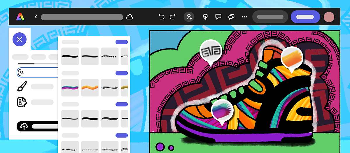
- Drawing in Adobe Express is integrated with Canvas and will soon work with Google Classroom. Read more about Adobe Express for Education .
- To access your drawings, go to Your stuff in the left panel on the Adobe Express homepage and select Files .
More like this
Got a question or an idea.

Get help faster and easier
Quick links
Legal Notices | Online Privacy Policy
Share this page
Language Navigation

By continuing to use our site, you agree to our Private Policy and Terms of Use .
Colman Domingo actually understood the 2024 Met Gala assignment
Men of the met gala, pay attention to colman domingo.
credit: Jamie McCarthy/Getty Images; John Shearer/WireImage)
Rustin star and Oscar nominee Colman Domingo is serving one of the early slays on this year's Met Gala red carpet in a gorgeous caped black and white suit with a bouquet of white lilies. The outfit is a custom ensemble designed by queer designer/artist Willy Chavarria.
Colman Domingo has arrived at the #MetGala . pic.twitter.com/vlB5HQqEOB — Pop Base (@PopBase) May 6, 2024
Twitter user @francemothers pointed out that Domingo seemed to be one of the few celebs, at least early on, to reference the short story this year's gala theme is named after.
Colman Domingo #MetGala2024 seems to also be giving his interpretation on the character ‘Count Axel’ from the short story the gala is themed after, “Garden of Time” Hence the handful of flowers. https://t.co/c7ZhK2stuD — MOTHER OF ALL MOTHERS. (@francemothers) May 6, 2024
"Colman Domingo seems to also be giving his interpretation on the character 'Count Axel' from the short story the gala is themed after, 'Garden of Time'" @francemothers wrote. "Hence the handful of flowers."
credit: Jamie McCarthy/Getty Images
Chavarria also attended the Gala along with Marc Metrick. He is also wearing an oversized white and black suit. His suit features white pants and a white jacket with a large flower on the lapel.
Every event belongs to Colman Domingo #MetGala2024 📸: Getty Images pic.twitter.com/jTMQ5SSeDe — Netflix (@netflix) May 6, 2024
This year's theme for the red carpet is "Garden of Time," and the gala's co-chairs are Bad Bunny, Jennifer Lopez, Chris Hemsworth, and Met Gala icon Zendaya. The Metropolitan Museum of Art's exhibition theme is "Sleeping Beauties: Reawakening Fashion."
Latest Stories
17 times male celebrities had to say they weren't gay
Meet sean palmieri, 'selling the oc's bisexual hottie, ranking the highest-earning queens in 'rupaul's drag race' herstory, here are the top 10 friendliest cities in the world for queer & trans travelers, 29 lgbtq+ celebs you can follow on onlyfans, family forever 10 queer celebs who have lgbtq+ siblings, 14 queens who quit or retired from drag after 'rupaul's drag race', 21 lgbtq+ reality dating shows & where to watch them, 30 pics of 'foundation' star lee pace that exude big daddy energy, 21 lgbtq+ tv shows we loved that only lasted one season, 21 of our favorite—but problematic af—fictional queer women, 15 'drag race' queens who were shockingly eliminated after 1 lip sync, 20 hotties who perfected the art of the mirror selfie, 26 actors who showed bare ass in movies & tv shows, 21 pokémon who are totally, absolutely, definitely queer, 15 unforgettable gay kissing scenes from tv & movies, 10 unforgettable lesbian & sapphic kisses from tv & movies, here's how long each pit crew hunk has been on 'rupaul's drag race', yes, ricky martin is showing you his feet pics for free, 25 lgbtq+ movies we can't wait to watch in 2024, trending stories.

France becomes world’s first country to enshrine abortion rights in constitution

Why is a mother’s mental health so important? A doctor explains

Justice Dept plans to reschedule marijuana as a lower-risk drug

Alyssa Edwards reveals her all-time favorite meme from 'RuPaul's Drag Race'

Walmart to close all of its health care clinics

Here’s what’s on tap at the 30 lesbian bars in the U.S. this weekend

Stormy Daniels takes the witness stand in Trump hush money criminal trial

The Talk: Starting your journey with HIV

Out and About with Joel Kim Booster

How climate disasters hurt mental health in young people

This queer author is teaching kids to be kind: 'There is nothing political about kindness'

10 last-minute travel destinations and hotels perfect for Pride 2024

A baby Beiber is on the way! Justin and Hailey announce pregnancy

‘Ozempic babies’: Reports of surprise pregnancies raise new questions about weight loss drugs

Elon Musk uses burner accounts on X, doesn’t fact-check: report

Joe Fryer, NBC News' jack-of-all-trades, is his social studies class's newest celebrity

Who is Kristi Noem? A look at the anti-LGBTQ+, dog-killing governor and vice president aspirant

15 hunky celebs in their shorty shorts that leave us weak in the knees

All 6 rogue Mississippi cops got long prison sentences in 'Goon Squad' torture of 2 Black men

Mixed reviews for airlines in the latest J.D. Powers passenger rankings

Your guide to every Pride celebration happening in the U.S. in 2024

10 ‘Drag Race’ looks that would have SLAYED the ‘Garden of Time’ Met Gala theme

Joe Biden has tied the record for most LGBTQ+ judges confirmed in federal courts

Pittsburgh’s gay police chief is stopping crime and living proud (exclusive)

Fire Island Pines is set for steamy summer fun in 2024
Most recent.

Joe Biden launches ‘Out for Biden-Harris’ campaign initiative to engage & woo LGBTQ+ voters (exclusive)

Savor vibrant bites as the best traveling queer food festival continues its journey east

Watch: Jinkx Monsoon Mystifies as The Maestro in New ‘Doctor Who’ Teaser

'Drag Race' star Heidi N Closet's brutal Sherry Pie SHADE has us CACKLING

Federal judge grants Casa Ruby founder Ruby Corado pre-trial release from D.C. jail

Carrie Underwood solidifies herself as a can't-miss entertainer in Las Vegas

Election season got you down? This crisis line is soothing LGBTQ+ mental health

Discover endless fun at The Pride Store: Games & electronics for all ages

The Talk: Thriving with HIV
5 ways Stormy Daniels damaged Donald Trump’s campaign and mussed up his hair

Top 5 times Stormy Daniels DESTROYED Trump during her testimony and made us CACKLE

Andy Cohen cleared of shocking allegations made against him by former Real Housewives

Giselle Byrd is taking center stage — and helping others do the same

Lesbian and bisexual women live shorter lives than straight women. Here's why

16 Republican AGs threaten Maine over protections for trans care and abortion

'Kingdom of the Planet of the Apes' offers modern thrills & nostalgic joys — but is it queer?

South Carolina has passed a gender-affirming care ban. Here's what families can do

Before AIDS, gay artist Rex drew hot men on the prowl — then he disappeared

The menthol diaries: Taking back pride from tobacco

Unlocking a new level of beauty with Dr Botanicals' ethical skincare line

Unleash your wild side with The Pride Store’s beginner’s guide to kink

The Talk: What HIV isn’t

A GOP school board member tried to ban a student's art for being 'offensive' to Christians

The Talk: Finding balance with HIV
Recommended stories for you.
Mey Rude is a journalist and cultural critic who has been covering queer news for a decade. The transgender, Latina lesbian lives in Los Angeles with her fiancée.

These 3 Men Clearly Understood the Assignment on the Met Gala Red Carpet
The men have entered the building.

It’s the night fashion lovers (like myself) have been waiting for: the 2024 Met Gala . As some of Hollywood’s biggest stars walk the steps of the Metropolitan Museum of Art, it’s safe to say that the male attendees have given the women a run for their money . But if I were asked to name those who fully embody this year’s theme, “ Sleeping Beauties: Reawakening Fashion ,” there are three men who immediately come to mind.
If there’s one thing Colman Domingo is going to do it’s make a statement. The Rustin star showed up to the star-studded event wearing a gorgeous caped black and white suit designed by Willy Chavarria.
And if that weren’t enough, the 54-year-old actor added a splash of greenery with a white floral bouquet. But what *really* made this outfit pop was his bright hazel contacts, which instantly gave off major vampire vibes.

Next, we have Dan Levy. The Schitt’s Creek alum stood out in a stunning black Loewe suit that features an eye-popping floral pattern that extends from the middle of the blazer to his pants. And to tie the entire look together, the filmmaker wore shiny black loafers.

Last but not least, Bad Bunny. The Spanish singer and rapper, who made his Met Gala debut in 2022, certainly didn't disappoint with his ensemble this year. The 30-year-old musician turned heads in a custom Maison Margiela black suit—and to say the award-winning artist gave Prince Charming would be an understatement.

In case you missed it, Bad Bunny is serving as a co-chair alongside Zendaya, Jennifer Lopez and Anna Wintour. When asked about how he chose his Met Gala look for this year, the Puerto Rican native recently told Vogue that unlike other red carpets, you “can’t really improvise” at the Met Gala. He added, “If I want to attend a different red carpet and decide to wear boxers last minute, I do it. I just do it.”
Way to steal the show, fellas.
All the Astonishing Looks from the 2024 Met Gala Red Carpet
Want all the latest celebrity news sent right to your inbox? Subscribe here .

Assistant Editor, News And Entertainment
Elsa Hosk Understood the Assignment With Her Head-to-Toe Tiffany Blue Look
The supermodel wore the apropos ensemble for a Tiffany & Co. gala in Beverly Hills

The Swedish model couldn’t have chosen a more fitting dress for the event—it was pulled from the Maison Alaïa Spring/Summer ’24 ready-to-wear collection. The sheer design was made of a body-hugging material and featured a turtleneck and exposed stitching throughout.

However, the real showstopper of the piece was the sleeves, which were adorned with puffy appliqués along the forearms that looked like hand muffs or bouquets of blue roses. These frills added a playful touch to the otherwise understated design, and Hosk certainly had fun showing them off on the red carpet.

As for the rest of her look, the supermodel layered a matching blue bodysuit underneath the sheer dress, and it seemed she had a lining added to the design as well, since it wasn’t quite as see-through as it originally appeared on the runway.
Then, she accessorized with matching heels that had bubbles of material forming the straps, and she layered a few silver chains on top of the dress around her neck—from Tiffany & Co., naturally. The only other color present in Hosk’s look was a tiny pop of yellow, which she added onto the fit via a teeny top-handle bag.

Joel is the editorial and social media assistant for HarpersBAZAAR.com, where he covers all things celebrity news. When he steps away from the keyboard, you can likely find him singing off-key at concerts, scavenging thrift stores for loud wardrobe staples, or perusing bookstores for the next great gay romance novel.
Celebrity News

King Charles Gives Harry’s Role to William

A Fake Photo of Katy Perry at the Met Went Viral
Kendall Jenner Is a Modern Flapper at the Met Gala

Doja Cat Wears a Wet White T-Shirt to the Met Gala

EmRata Brings Boho Festivalwear to Met Gala Party

Anya Taylor-Joy Wears a Literal Metal Minidress

Sabrina Carpenter and Barry Keoghan’s Relationship
Zendaya and Tom Holland’s Relationship Timeline

Kendall Wore Two White Dresses to Met Gala Parties
Zendaya Brings the Drama to the 2024 Met Gala

Kendall & Bad Bunny Reunite at Met Gala
HTML Tutorial
Html graphics, html examples, html references.
HTML is the standard markup language for Web pages.
With HTML you can create your own Website.
HTML is easy to learn - You will enjoy it!
Easy Learning with HTML "Try it Yourself"
With our "Try it Yourself" editor, you can edit the HTML code and view the result:
Click on the "Try it Yourself" button to see how it works.
In this HTML tutorial, you will find more than 200 examples. With our online "Try it Yourself" editor, you can edit and test each example yourself!
Go to HTML Examples!
Advertisement
HTML Exercises
This HTML tutorial also contains nearly 100 HTML exercises.
Test Yourself With Exercises
Add a "tooltip" to the paragraph below with the text "About W3Schools".
Start the Exercise
HTML Quiz Test
Test your HTML skills with our HTML Quiz!
Start HTML Quiz!
My Learning
Track your progress with the free "My Learning" program here at W3Schools.
Log in to your account, and start earning points!
This is an optional feature. You can study at W3Schools without using My Learning.

At W3Schools you will find complete references about HTML elements, attributes, events, color names, entities, character-sets, URL encoding, language codes, HTTP messages, browser support, and more:
Kickstart your career
Get certified by completing the course

COLOR PICKER

Contact Sales
If you want to use W3Schools services as an educational institution, team or enterprise, send us an e-mail: [email protected]
Report Error
If you want to report an error, or if you want to make a suggestion, send us an e-mail: [email protected]
Top Tutorials
Top references, top examples, get certified.

IMAGES
VIDEO
COMMENTS
HTML Images - W3Schools is a comprehensive tutorial that teaches you how to add, resize, align, and style images in your web pages. You will also learn how to use the HTML img tag and its attributes, such as src, alt, height, and width. Whether you want to create a photo gallery, a logo, or a border image, this tutorial will help you master the basics of HTML images.
Multimedia and Embedding Images; Prerequisites: Basic software installed, basic knowledge of working with files, familiarity with HTML fundamentals (as covered in Getting started with HTML.): Objective: To learn how to embed simple images in HTML, annotate them with captions, and how HTML images relate to CSS background images.
Images are an essential part of web development, adding visual appeal and context to your web pages. In HTML, you can easily incorporate images to enhance the user experience. This article will guide you through the basics of working with images in HTML and help you understand images in HTML better. How to Insert an Image into a Web Page
W3Schools offers free online tutorials, references and exercises in all the major languages of the web. Covering popular subjects like HTML, CSS, JavaScript, Python, SQL, Java, and many, many more.
Positioning and aligning images on an HTML page is crucial to layout the page. One of the most common questions is how to align an image to the center of a section. ... We can assign margin: auto; style to a block element to center it. But we know that image tags are inline, not block elements so we have to assign a display: block; CSS style to ...
A Computer Science portal for geeks. It contains well written, well thought and well explained computer science and programming articles, quizzes and practice/competitive programming/company interview Questions.
If the image is described adequately by the main text body, you can just use alt="". Link. If you put an image inside <a> tags, to turn an image into a link, you still must provide accessible link text. In such cases you may, either, write it inside the same <a> element, or inside the image's alt attribute.
This guide is about the HTML syntax for responsive images (and a little bit of CSS for good measure). The responsive images syntax is about serving one image from multiple options based on rules and circumstances. There are two forms of responsive images, and they're for two different things: If your only goal is….
History of the img tag. Prior to 1993, the web was not a very friendly place for images. But in 1993 the img tag was proposed and Mosaic, the first browser to display images inline with text, was launched. Before Mosaic and the img tag images were loaded in a separate window or downloaded and opened with an image viewer. However, with Mosaic and the img tag added to HTML, the mid-1990s saw ...
Using the HTML5 Picture Element. Sometimes, scaling an image up or down to fit different devices (or screen sizes) doesn't work as expected. Also, reducing the image dimension using the width and height attribute or property doesn't reduce the original file size. To address these problems HTML5 has introduced the <picture> tag that allows you to define multiple versions of an image to target ...
Note: Make sure to copy the relative or project file path of the image rather than the absolute or full file path of the image. The relative path refers to the file location relative to the current working directory (as opposed to the absolute path, which refers to the file location relative to the root directory.) While both paths will work in this instance, only the relative path would work ...
If you want to learn how to position an image at a specific location on a web page, you can find a helpful answer on this Stack Overflow question. The answer explains how to use CSS properties such as position, top, left, right, and bottom to control the image placement. You can also see a live demo of the code and some useful comments from other users.
Do you want to learn how to make your images clickable and link to other web pages? In this tutorial, you will discover five different methods to create links from images in HTML, using simple code examples and explanations. Whether you want to use an image as a link, a button, a map, or a combination of image and text, this guide will help you master the skill of linking images in HTML.
Inherits properties from its parent, HTMLElement. HTMLImageElement.alt. A string that reflects the alt HTML attribute, thus indicating the alternate fallback content to be displayed if the image has not been loaded.. HTMLImageElement.complete Read only . Returns a boolean value that is true if the browser has finished fetching the image, whether successful or not.
Image Maps. The HTML <map> tag defines an image map. An image map is an image with clickable areas. The areas are defined with one or more <area> tags. Try to click on the computer, phone, or the cup of coffee in the image below: Example. Here is the HTML source code for the image map above:
3 HTML Elements Used to Create Image Maps. 4 Creating a Simple Image Map. 4.1 Step 1: Determine the size of our image. 4.2 Step 2: Create a map to overlay the image. 4.3 Step 3: Define the coordinates for the map shapes. 4.4 Step 4: Put it all together. 5 Learn More About Image Maps. 6 Server-Side Image Maps.
We have gathered a variety of HTML exercises (with answers) for each HTML Chapter. Try to solve an exercise by editing some code. Get a "hint" if you're stuck, or show the answer to see what you've done wrong. Count Your Score. You will get 1 point for each correct answer. Your score and total score will always be displayed.
This, the default value, sends the form data as a string after URL encoding the text using an algorithm such as encodeURI(). multipart/form-data. Uses the FormData API to manage the data, allowing for files to be submitted to the server. You must use this encoding type if your form includes any <input> elements of type file ( <input type="file"> ).
Do you want to learn how to align image in HTML? This article from GeeksforGeeks explains the different ways of using the align attribute, the CSS properties, and the flexbox layout to position images in your web pages. You will also find examples and code snippets to help you master this skill.
HTML Assignment and HTML Examples for Practice. UNIT - 1 Text Formatting Assignment 1 Assignment 2 Assignment 3 Assignment 4 Assignment 5- India. UNIT - 2 Working with Image Assignment 1 Assignment 2 Assignment 3 Assignment 4 - Running Animals. UNIT - 3 Working with Link Assignment 1 Assignment 2 Assignment 3 Assignment 4. UNIT - 4 List
The Online Writing Lab at Purdue University houses writing resources and instructional material, and we provide these as a free service of the Writing Lab at Purdue.
New drawing capabilities in Adobe Express provide a digital canvas for educators and students who want to elevate their assignments with our collection of expressive brushes. You can create a blank Drawing or select from a set of education-oriented Drawing worksheet templates.
Men of the Met Gala, pay attention to Colman Domingo! credit: Jamie McCarthy/Getty Images; John Shearer/WireImage)
The effect will be that the page layout will change during loading (while the images load). Tip: Downsizing a large image with the height and width attributes forces a user to download the large image (even if it looks small on the page). To avoid this, rescale the image with a program before using it on a page.
In case you missed it, Bad Bunny is serving as a co-chair alongside Zendaya, Jennifer Lopez and Anna Wintour. When asked about how he chose his Met Gala look for this year, the Puerto Rican native recently told Vogue that unlike other red carpets, you "can't really improvise" at the Met Gala. He added, "If I want to attend a different red carpet and decide to wear boxers last minute, I ...
Elsa Hosk Understood the Assignment With Her Head-to-Toe Tiffany Blue Look. ... Stefanie Keenan // Getty Images. However, the real showstopper of the piece was the sleeves, which were adorned with ...
Responsive Image Gallery. How to use CSS media queries to create a responsive image gallery that will look good on desktops, tablets and smart phones. Well organized and easy to understand Web building tutorials with lots of examples of how to use HTML, CSS, JavaScript, SQL, Python, PHP, Bootstrap, Java, XML and more.
Learn how to create and style web pages with HTML, the standard markup language for the web. W3Schools HTML Tutorial offers easy and interactive examples, exercises, quizzes, and references to help you master HTML. Whether you are a beginner or a professional, you will find something useful in this tutorial.