Don’t Present Without These 16 PowerPoint Dos and Don’ts


Table of Contents
Have you ever struggled to hold your audience’s interest during a presentation? Painstakingly created slide after slide only to be met with bored, disengaged faces?
Even the most confident speakers can falter when it comes to crafting compelling PowerPoint decks. Without proper slide design best practices, it’s easy to lose your audience in a sea of dense text, chaotic graphics, and disorganized content.
You don’t have to suffer through presenting lackluster slides anymore. In fact, following simple PowerPoint best practices can totally transform your deck from meh to marvelous.
In this post, we’ll share 16 PowerPoint dos and don’ts to level up your presentations and captivate audiences. These tips will help you create professional, visually striking slides your viewers will remember.

16 Dos And Don’ts Of Powerpoint Presentations
Here are some important 16 presentation dos and don’ts you need to keep in mind while creating slides and presenting them.
PowerPoint Dos
Let’s start with the best practices and strategies to implement when designing PowerPoint presentations . What techniques should you use to create memorable, polished slides?
1. Keep It Simple With Minimalist Design
Let’s start with a common mistake – overcrowded, distracting slide design. We get the temptation to tart up slides with fancy backgrounds. But resist the urge! Fancy templates with complex colored patterns or photos unrelated to your content just make it harder to digest key information.
Instead, embrace the power of simplicity. Stick to minimalist templates and avoid template themes with extra decorations. Use neutral backgrounds and empty negative space to let your content shine. Remember, your audience came for your message, not for clip art kittens. Keep slides clean and attention stays where it should be.
2. Cut the Clutter – Follow the 6×6 Rule
Now for another slide buzzkill – mammoth blocks of dense text. You may be tempted to pack slides with long sentences and paragraphs. Don’t give in! Text-heavy slides are guaranteed to lose audiences fast.
For easy-to-digest nuggets, follow the handy 6×6 rule. Limit slides to just 6 lines of text maximum, with each line containing 6 words max. Anything more turns into an overwhelming wall of words.
Stick to concise phrases, short sentences, and bulleted lists. Use just keywords and supporting stats – leave nonessential info out. With this less is more approach, key points will stick better.
SlidesAI is a text-to-presentation add-on tool that converts walls of text into beautiful slides. It does this automatically generate condensed phrases and bullet points from your text ensuring clutter-free slides throughout your presentation.
3. Boost Engagement With Quality Visuals
Speaking of key points sticking better…you know what helps even more? Quality graphics and visuals!
Research shows we process images 60,000 times faster than text. So reinforce your points with strong visuals. Use high-resolution photos, charts, illustrations, and infographics. But avoid clipart or random stock photos – ensure every graphic clearly supports your narrative.
Well-designed visuals make presentations more memorable and engaging. Just remember to optimize graphics for high-resolution viewing and include alt-text (alternative text) descriptions for accessibility. Then watch those visual aids boost information retention and audience interest.
SlidesAI has a library of 1.5M high-quality premium stock images that you can select and include in your slides.
4. Create Brand Consistency With Formatting
Imagine a presentation where every slide had a totally different layout, colors, and font… no visual consistency at all. It would look sloppy and amateurish, right?
Formatting matters – big time! Brand your presentation by using consistent design elements throughout all your slides.
Pick one professional font combination and stick to it. Limit your color palette to 2-3 colors max. Maintain alignment and space elements consistently.
With unified branding, your deck will feel polished, intentional, and visually pleasing. Bonus – consistent branding also boosts memorability as the audience becomes familiar with your “look”.
SlidesAI ensures complete branding consistency across all presentation slides by applying your color schemes , fonts, etc to designs through artificial intelligence.
5. Check Accessibility Settings
Speaking of memorability, if some audience members can’t actually view your slides, they certainly won’t remember your message.
Ensure your presentation is inclusive and accessible to all by checking key settings. Use color contrast and legible fonts so those with visual impairments can still grasp the content. Optimize images with alt text descriptions. Verify videos are captioned.
It may take a bit more effort up front but making your presentation accessible opens your message to a wider audience. It also demonstrates corporate responsibility.
6. Create Custom Icons and Illustrations
Most PowerPoint templates come with generic icons. However, you can amplify brand personality and memorability by creating custom icons and simple illustrations.
Don’t just use a generic checkmark when you can insert your own branded indicator relevant to your company. Design illustrated characters to represent concepts. Even use emojis strategically to inject fun and improve recall.
Handcrafted visuals, even if basic in style, make presentations stand out and drive home key points better than generic clip art ever could.
7. Use Subtle Animations – But Not Too Many!
Animations, when used well, can help guide the audience’s eye and transition between ideas smoothly. Emphasize key points and important transitions with subtle animations.
Entrance and exit effects can focus attention while builds and motion path animations can demonstrate processes dynamically. Use sparingly and subtly for the best impact.
But avoid going animation crazy with sounds and excessive movement. That becomes more distracting than engaging. Limit animations so they enhance content rather than detract.
8. Pace Your Delivery
Creating stellar slides is an excellent start but don’t stop there. The live delivery is just as crucial. Invest time practicing your presentation with your slides.
Rehearse the flow and pace of your narrative. Refine and memorize transitions between slides . Nail your timing to keep the audience engaged. Get so comfortable delivering your content that the slides become natural visual aids.
With great slides and honed delivery skills, your audience will hang on to your every word from the introduction to a powerful conclusion.

Create presentation slides with AI in Seconds in Google Slides
10M+ Installs
Works with Google Slides
PowerPoint Donts
Just as important as the dos are the don’ts. What pitfalls should you avoid when designing PowerPoint presentations?
9. Don’t Use Distracting Backgrounds
Remember our tip to embrace minimalism? Well, the opposite is using distracting backgrounds. Avoid loud colors, complex patterns, or images totally unrelated to your content. At best, they are distracting. At worst, they make key info harder to comprehend.
Stick to simple, neutral backgrounds. If using an image, ensure it directly reinforces your narrative. Anything extra risks your message getting visually lost. Keep backgrounds clean so content remains the focal point.
SlidesAI avoids using distracting backgrounds like crowded templates or unrelated images in the presentations. It focuses on simple, clean backgrounds to keep attention on your key content.
10. Don’t Overwhelm With Walls of Text
We covered the 6×6 text limit rule earlier. But even with 6 lines and 6 words, slides can become text walls without good visual breakdown. Big blocks of text are tiring to read and make retainment tough.
Instead, thoughtfully chunk text into concise sections. Use headers, subheaders, and bullet points to organize key bits. Align text left for easier scanning. Supplement with supporting imagery. Breaking up text improves comprehension drastically.
11. Don’t Rely On Boring Bullets
Speaking of bulleted lists, bullet overkill is another issue that turns slides into snore fests. Slides crammed with back-to-back bullet points lose audiences fast. The endless text blurs together with minimal memorability.
For memorable content, limit bullets to key takeaways only. Then reinforce each point visually – a photo, icon, chart, etc. Quality visuals boost memorability way more than a slide stuffed with 11 bullet points ever could.
12. Don’t Use Inconsistent Formatting
Remember, formatting matters! Shifting layouts, fonts, and color schemes appear disjointed and sloppy. The mismatched design screams amateur hour.
Establish a visual style and stick to it slide to slide. Use the same fonts, limit your color palette, and space elements consistently. Most importantly – maintain alignment across all slides. With unified branding, your presentation will look polished and professional.
SlidesAI ensures your presentation formatting stays consistent slide to slide by applying your preferred color palette, fonts, etc through its intelligent algorithms.
13. Don’t Include Unnecessary Animations
Animations can be great for guiding the viewer’s eye and demonstrating motion. But avoid going overboard. Excessive animations, sounds, and movement become more distracting than engaging.
Use animations subtly and intentionally . Emphasize only key points and important transitions with simple builds or entrance effects. Anything superfluous, whether flying text or whooshing sounds, pulls attention away rather than enhancing content.
Keep it simple and purposeful. Let smooth, minimal animations work behind the scenes rather than take center stage away from your narrative.
14. Don’t Use Unsupported Graphics
Only include images, photos, charts, etc that directly support the ideas and messaging in your presentation. Don’t insert fluffy visuals that have no clear tie to your content.
Every visual aid you present should clearly reinforce your narrative rather than derail tangents. Unsupported graphics quickly become distractions. They also undermine your credibility if audiences can’t grasp the connection.
Keep it focused. Be intentional about every visual you include. Remove anything superfluous that doesn’t serve a purpose.
15. Don’t Plagiarize Content
While it’s fine to find inspiration from other presentations, copying chunks of text or visuals without proper attribution is unethical. Never pass off someone else’s hard work as your own.
Always credit sources directly within your presentation if incorporating external ideas, quotes, charts, images, etc. Also, avoid violating copyright laws by inserting visuals without licensing them appropriately first.
Your presentation should showcase your unique ideas, voice, and message. Ensure you create original content or properly cite anything derived from others. Your integrity depends on it.
16. Don’t Wing Your Speech
With great slides completed, don’t just wing it on presentation day. The live delivery is just as crucial. Invest time to refine your pacing, transitions, slide timing, and flow.
Practice your speech thoroughly with the deck so your narrative and movements feel natural. Nail down transition phrases between slides. Get 100% comfortable presenting your content.
With stellar slides and a well-rehearsed delivery, your presentation is sure to wow audiences from start to finish.

There you have it – 16 PowerPoint dos and don’ts for creating memorable, professional PowerPoint presentations. Apply the dos to make high-impact slides, and avoid the don’ts for mistake-free presentations.
Put these PowerPoint best practices into play and watch your ordinary slides transform into extraordinary visual stories. Your audiences will be engaged from start to finish.
But even with these tips, crafting stunning presentations can be time-intensive. Instead, let SlidesAI do the work for you using the power of AI.
SlidesAI integrates with Google Slides and PowerPoint (coming soon) to instantly generate professional presentation decks from your content. Simply input your text – SlidesAI will turn them into visually cohesive slides designed for audience engagement.
SlidesAI saves tons of time by handling slide layouts, formats, graphic design, and branding tailored to you. The AI delivers presentation-ready slides in seconds.
Take your Presentation skills from amateur to pro – try SlidesAI for free today!\
- No design skills required
- 3 presentations/month free
- Don’t need to learn a new software
Frequently Asked Questions
What are the dos and don’ts of powerpoint presentations.
Key PowerPoint dos include simple designs, concise text, quality visuals, consistency, accessibility, custom icons, subtle animations, and practice. Don’ts involve distracting backgrounds, walls of text, boring bullets, inconsistent formatting, excessive animations, irrelevant graphics, plagiarism, and winging it.
What is the 5 by 5 Rule in PowerPoint?
The 5 by 5 rule recommends having no more than 5 lines of text per slide and 5 words per line. This keeps each slide focused and text easy to digest. Too much text overwhelms audiences.
What is the 7 Rule on a PowerPoint Presentation?
The 7 rule states that your slides should have no more than 7 bullet points. Like the 5 by 5 rule, this maintains simplicity for the audience. More than 7 bulleted items become hard to retain.
What are the 5 Rules of PowerPoint?
5 key rules are: don’t cram slides with too much text, minimize slides for emphasis, utilize quality visuals, stick to a consistent format, and limit animations. Following these makes presentations professional, clean, and engaging.
Related Posts

Mastering PowerPoint: How To Change Color Scheme In PowerPoint
Ever looked at your PowerPoint presentation and thought it lacked a bit of color pizzazz? Sometimes, a splash of color can make all the difference between an ordinary and an extraordinary presentation. Whether you want to align your slides with your brand’s color scheme, emphasize certain points, or simply inject some visual interest, knowing how […]
How to Loop a PowerPoint Presentation?
PowerPoint presentations are a go-to for clear and informative content delivery. But what if you want your presentation to run on repeat, like at a kiosk or digital sign? The good news is, that PowerPoint has a built-in feature to loop your slideshow, ensuring your message stays on display without interruption.
How to Add Fonts to PowerPoint?
The font you choose can make a major difference in your PowerPoint presentations. While the default fonts are okay, you might want to add your own for a more specific look. Luckily, adding fonts to PowerPoint is quite easy. This can improve the appearance of your slides and help you get your message across more clearly. In this article, we’ll show you the simple steps to add fonts in PowerPoint, letting you personalize your presentations and keep your audience engaged.
Save Time and Effortlessly Create Presentations with SlidesAI

- Pitch Decks & Investor Materials
- B2B Graphic Design
- Startup Consulting
- Trainings & Workshops
- Case studies
- Downloadable resources
18 PowerPoint Dos and Don’ts
- Presentation design /
- Visual communication

While there are many who advocate for this new app and that great new program, Microsoft Office’s PowerPoint remains the lifeblood of many marketing presentations and documents. It’s our old friend who knows our needs and wants better than we know them ourselves, who’s always there for us in times of big campaigns and important reports.
For those looking to improve their presentations, these PowerPoint dos and don’ts will not disappoint – we’ve put all our research and experience into it to ensure that. If you’re just discovering PowerPoint’s endless capabilities, these tips will help you master it in no time.
We’ve also included some Pro Tips that might hold the answers to some of the questions you’ve been having. Let’s get started.
PowerPoint Dos
1. know your audience.
All marketing actions should start here. It’s the same for presentations, regardless of their intended purpose. Your information, design and style should be based on what your audience will understand and respond to.
Nancy Duarte, Principal of Duarte Design and author of “ Slideology ”, recommends asking 7 questions to know your audience and build an audience persona slide to place at the front of your presentation.

Download this PPT template from Duarte Design
2. Create a structure
Things can quickly spiral out of control if you dive head on to designing the document, without a structure in place. Even if you’re creating a presentation to illustrate an existing piece of content, you’ll still need to tailor it to PowerPoint specifics regarding quantity of information, succession of ideas, verbal details used when presenting it etc.
If you’re halfway through the presentation and don’t remember what comes next, go back to your structure. This will help maintain a cohesive train of thought and message flow.
For instance, we usually start our presentation creation process by putting together a structure of the presentation, then we add content to fill-in the structure and, finally, we design the content.
3. Use keywords
This will help you convey a clear message and keep your audience’s attention. It’s also of great help to you when creating the flow of the presentation.
Start with the topic of your presentation, your principal keyword will derive from that and will most likely be comprised in the presentation title. The structure of your presentation will give you another set of keywords.
For example, this presentation starts with 2 main longtail keywords: search content and social content. If you browse through the presentation you’ll notice that certain keywords that are essential to the topic at hand are distributed recurrently throughout the presentation, such as: content marketing, social media, digital channels and content strategy.
Search Content vs. Social Content von SEMrush
4. Organize your information clearly
Be brief and clear. Don’t crowd your slides. Instead, opt for no more than 2-3 sentences per slide and keep in mind your keywords. Think of them more like statements than sentences.
Treat your slides like billboards .
If you’re using lists, 6 bullets/points per slide should cover it. Make sure to leave enough space between lines of text.
Limit the number of slides. A good case practice is using 20-30 slides or one slide per minute.
Use section divider slides; this will help break up content into memorable chunks.
5. Use a legible font
Opt for a legible font and type size. Don’t use eccentric fonts that will make it impossible to make out the actual words. Stick to standard, easy-to-read fonts, preferably sans-serif (fonts such as Arial or Helvetica). This will also minimize the risk of having your fonts substituted when sending to other people.
Titles should be at least 28 to 48 points, bulleted text or body copy at least 24 points. Only use caps in headlines and section titles, not in paragraphs.

6. Ensure design consistency
Create a template based on your brand guidebook, using the company logos and colors. This will make it so much easier to create consistent presentations and maintain design unity across your work.
Create different layouts for different occasions, within the same template; this way, your presentations will be unified from a design point of view but still have original elements given by the different layouts used.

Featured Download: An Easy Guide To Repurposing Content
Get your free copy
7. Be smart about colors
If your brand book already has a color palette you’re all set. If you’re doing something different, you’ll want to make sure you’re using the appropriate colors: not too bright, high contrast, consistent. A color that looks good on your monitor does not necessarily look good on the big screen you’ll be using to present.
The relationships between the colors you’re using are also important. Limit the use of color to 2 to 4 colors/shades. Use colors that will stand out and will be easy on the eyes (dark backgrounds and light text is a good case practice.) Try Paletton to experiment with different combinations and see what would work best for what you have in mind.
Get inspired by this year’s Pantone color palette to design visually attractive presentations:
Presentation Design Tips – Pantone Best Colors To Use In 2017 from Visual Hackers
8. Use visual elements to illustrate your ideas
Graphs and charts can help show relationships, comparisons, and change. Illustrate your point by verbally discussing each element. Only include 1 to 2 images per slide. You can also use shapes to illustrate complex topics.
Make sure to use these visual graphics to enhance your message and increase understanding. Too much of anything can lead to over stimulating your audience and losing their attention.
9. Save, save, save
It’s best to prevent any technical mishaps and save your work every 5-10 minutes. Even though the program has an automatic save and recover function, there have been plenty of instances when it was too late or something went wrong. CTRL+S is your mantra.
10. End with a summary slide
It’s a good case practice to go through your key points and list the final benefits in a summary slide, at the end of your presentation.
The most important sections of your presentation are the beginning and ending. The beginning is when you will grab the attention of the audience. The summary ending will make it easier for them to remember your ideas.
Here’s an example from one of our clients’ presentations:

11. Keep your presentations well-organized
Store each presentation and its associated files in its proper folder, together with all the visual elements you’ve used.
12. Use animation and sound carefully
Like graphics, animations can be used to enhance your ideas. Abuse them, and you have information overload again. You can also integrate sounds into your presentation, if that’s something that supports your ideas or is needed.
For example, this animation emphasizes that the solution offered by the client is much faster and prevents higher losses:
13. Use transitions for a more dramatic impact
Transitions between slides can help your presentation make more of an impact. However, they can also be quite distracting. A good case practice is to keep transitions to a minimum and use the same transition or a variation of the transition.
Transitions can help when you want to break up content over several slides while still keeping a sense of continuity. Think of it as creating movie scenes rather than individual slides.
With the help of more complex animations and transitions, you can replicate modern effects you typically see on websites, such as parallax scrolling. This type of transition can help the narrative of your presentation and enhance it’s storytelling.
PowerPoint Don’ts
1. put everything on one slide.
It’s not as obvious as you might think. We’ve all done it, at one point. For those situations when there is still something to say, illustrate or include, take a step back and ask yourself “If I can’t see this slide and I can’t read off of it during my presentation, will I still be able to convey its essence?” And there you have your answer.
Only put the essence down. It’s recommended that you don’t use more than eight words per line or eight lines per slide. Start with creating the slides you want and then go back and edit them – remove all non-essential information, remove unnecessary words, and take out slides you can live without. Cut your presentation by as much as half to get to the core if it.
2. Overuse transitions, animations and sound
These effects are meant to be used scarcely, to increase the impact of one idea. They can become a distraction very quickly.
Keep your message front and center and spice up your presentation with enhancing elements at the end. Most presentations are just a visual aid; if you overload them, the audience will end up trying to read the slides and not paying attention to you.
3. Use hard-to-read color combinations and fonts
Stay away from red/green, brown/green, blue/black, blue/purple combinations. Instead, aim for a high contrast between background and text. Also, don’t use bright background colors that will strain your audience’s eyes.
You should also try not to use different colors and fonts on every single slide. Your template will help with this.
4. Use generic graphics and (very) stock photos
If you’re going to opt for visual elements, make sure they are well-designed and suited for your audience. Don’t use generic clipart you found on Google, that’s just offensive to your audience.
The same goes for stock photos that look the same and have been used by everyone. Chances are someone has seen or used that image as well, so instead of helping, it actually hurt your point.
5. Think the slides are for you
Too many people seem to think PowerPoint is just a speech handout. Your presentation is meant to help the audience follow you and to give the clues to organize the information you are sharing, it’s not a substitute.
Pro Tips and Tricks
Choose a story archetype to structure your presentationCreate custom slide sizes – for example, if you want to show a quick presentation to someone on your smartphone, you can create slides the size of your actual screenAlign objects to get a clean design – try this tool for slide proofingGet more control over objects’ designs using “Format” menus Create custom shapesCrop images into custom shapesEmbed your font files to make sure they don’t changeEmbed multimediaCompress images to reduce the size of the presentationUse Touch Bar shortcuts Use a black background for scientific presentations Convert vectors to editable shapes in PowerPoint
Whatever your choice of presentation creation program, remember that your ultimate goal is to convey a message. Follow the principles above and make sure everything you’re including in it supports your message and enhances it, without distracting the audience.
If you need help with creating a last-minute report or presentation, we’ve got just the team for you. Drop us an email and request a quote and we’ll make sure to help you deliver a successful presentation!
Image credit: Mind Blown – Liana Azwa via Behance.net
Are you ready to take your presentations to the next level?
Our team can help with everything from researching your project, writing the content, designing and building your slides, and even creating handouts.
Get in touch
Top articles
- Infographics
- Personal branding
- Pitch deck design
- PowerPoint tutorial
- Presentation design
- Public speaking
- Uncategorized
Sign up for our monthly newsletter
I really like it
That’s great! Thanks!
Thanks for the info. I really appreciate it
This is really great! It helps a lot!
Lol I love this but it could use some more donts
Thanks for the appreciation and feedback Mike. We’re actually working on an updated version of this article and it will have a few more Don’ts 😉
i agree more don’ts would help a lot
thanks for the insights. They are very helpful. I hope to benefit more in the future presentations
Great tips there Paula! Definitely gonna apply some of these to my upcoming presentations especially embedding visual media and adding touchbar shortcuts. I also found this article https://slideuplift.com/blog/powerpoint-hacks-you-did-not-know-for-effective-presentations/ helpful for some more dos and don’ts to create effective presentations.
Great tips for PPT makers. This certainly helps, will share the articles with my PPT design team. Thanks
Excellent article! Congratulations on the information. 57439559
Great PPT Dos and Don’t s
Leave a Reply Cancel Reply
Save my name, email, and website in this browser for the next time I comment.
This site uses Akismet to reduce spam. Learn how your comment data is processed .
- About Deck Sherpa
- Why Deck Sherpa
- Sherpa Wisdom

Do’s and Don’ts of Designing PowerPoint Presentations – What’s Important
Animations Bullet Point Presentations Business Presentation Corporate Presentation Design Data Visualization PowerPoint Design PowerPoint Presentation Professional Presentation Design

Discover the essential do's and don'ts of designing PowerPoint presentations. This will ensure you never struggle to maintain your audience's interest again. If you've ever crafted slides only to face a crowd of disengaged onlookers, you know how crucial engaging presentations are. Even seasoned speakers can stumble if their PowerPoint lacks clarity and visual appeal. By mastering how to make the best PowerPoint presentation, you can ensure that you deliver your message concisely and memorably. It helps you avoid the pitfalls of overwhelming text and disorganized designs.
8 Do's And 8 Don’ts Of PowerPoint Presentations
When it comes to the do's and don'ts of designing PowerPoint presentations, understanding the key elements can make all the difference. Whether you're aiming to inform, persuade, or engage, the way you design your slides plays a pivotal role in how your message is received. By focusing on essential design principles and avoiding common pitfalls, you can create a presentation that not only looks professional but also resonates with your audience. Let's delve into the crucial do's and don'ts that will elevate your PowerPoint skills and help you deliver your message effectively.

8 PowerPoint Do's: Enhancing Your Slides for Impact
1. opt for minimalist design.
Simplicity is key in the do's and don'ts of designing PowerPoint presentations. A minimalist design helps your audience focus on what's important without getting distracted by too many details. This approach, emphasizing how to make the best PowerPoint presentation, involves using a clean layout, ample white space, and limiting the number of elements on each slide. By keeping it simple, you enable your audience to absorb and retain the information more effectively.
2. Eliminate Clutter with Design Rules
Effective presentation design is all about clarity and engagement. The 5-5-5 rule suggests limiting yourself to five words per line, five lines per slide, and five text-heavy slides in a row to avoid overwhelming your audience. The 10-20-30 rule by Guy Kawasaki advocates for 10 slides in a 20-minute presentation with a minimum 30-point font size. Lastly, the 6x6 rule recommends no more than six bullet points per slide and six words per bullet. These guidelines help in creating slides that are easy to follow and impactful.
3. Enhance Engagement with Quality Visuals
Using high-quality visuals is a fundamental aspect of PowerPoint presentation do's and don'ts. Graphics, images, and charts serve as powerful visual aids that can make your presentation more engaging and easier to understand. They can break up text, illustrate points, and add a layer of storytelling to your presentation. Remember, a relevant and striking visual can convey your message more powerfully than words alone.
4. Foster Brand Consistency
Consistency in your presentation's formatting reinforces your brand and message. This involves using a consistent color palette, typography, and design elements throughout your slides. Such a consistent design not only looks professional but also makes your presentation more coherent and memorable to the audience.
5. Prioritize Accessibility
Ensuring your PowerPoint is accessible to everyone, including individuals with disabilities, is crucial. This means checking color contrasts, providing text alternatives for images, and ensuring your presentation can be navigated without a mouse. Making your presentation accessible is a key step in being inclusive and reaching a wider audience effectively.
6. Incorporate Custom Icons and Illustrations
Custom icons and illustrations can add a unique and personal touch to your presentation, making it stand out. These design elements, tailored to your message, can enhance understanding and retention. Avoid generic clip art in favor of custom graphics that align with your content and branding.
7. Employ Subtle Animations
Animations can be a useful tool when used sparingly. They should enhance, not distract, helping to emphasize key points or transition smoothly between topics. Subtle animations can guide your audience's attention and contribute to a dynamic and engaging presentation.
8. Control Your Presentation's Pace
Timing is everything. Pacing your delivery ensures that your audience stays engaged and can absorb the information you're presenting. It's important to allocate time wisely, giving each slide its moment, without rushing or dragging the presentation.

8 PowerPoint Don'ts: Avoiding Common Pitfalls
1. avoid busy backgrounds.
Distracting backgrounds can make your text hard to read and divert attention from your main message. Stick to simple, clean backgrounds that support your content rather than competing with it. This helps keep your audience focused on what you're saying, not where you're saying it.
2. Refrain from Overloading Slides with Text
Too much text can overwhelm your audience, making it hard for them to follow along and retain information. Use bullet points strategically to convey information concisely and keep your audience engaged. Remember, slides are there to support your speech, not to serve as a script.
3. Move Beyond Basic Bullets
While bullet points are a common feature in presentations, relying solely on them can become monotonous. Mix up your slide formats with visuals, charts, and other elements to keep your audience interested and engaged. This variety can make your presentation more dynamic and memorable.
4. Maintain Formatting Consistency
Inconsistent formatting can be jarring and detract from your message's professionalism. Ensure that your slides are uniformly styled in terms of fonts, colors, and layout. This consistency helps build a cohesive narrative throughout your presentation.
5. Limit Animation Use
While animations can add interest, too many can be distracting and detract from your message. Use animations purposefully and sparingly to enhance your presentation without overwhelming your audience with too much motion.
6. Avoid Using Unsupported Graphics
Ensure that all your graphics and visuals are supported by your presentation software and the hardware you'll be using. Unsupported graphics can lead to technical issues that disrupt your flow and distract your audience.
7. Never Plagiarize
Originality is key in presentation design. Ensure all your content is original or properly credited. Plagiarizing not only undermines your credibility but also disrespects the original content creators.
8. Don't Improvise Your Speech
In designing PowerPoint presentations, don't overlook the importance of rehearsing your speech. It's not just the slides that matter but also how you present them. Spend time aligning your speech with your visuals to keep the audience engaged. Practicing ensures your delivery is smooth and your information clear, making your professional PowerPoint presentations effective. Thorough preparation will help you captivate your audience from start to finish.
In the realm of PowerPoint presentation do's and don'ts, striking the right balance between informative content and engaging design is crucial. By adhering to these guidelines, you're not just creating slides; you're crafting a narrative that captures and retains your audience's attention. Remember, the success of your presentation hinges on both the clarity of your content and the effectiveness of your design. As you employ these strategies in your professional PowerPoint presentations, you'll not only keep your audience engaged but also convey information in a way that's impactful and memorable. Embrace these practices to ensure your next presentation stands out for all the right reasons.

Come to Deck Sherpa for Professional PowerPoint Presentations
Understanding and implementing the do's and don'ts of designing PowerPoint presentations is crucial for maintaining your audience's engagement and effectively delivering your message. These guidelines are not just rules; they are the building blocks for creating slides that are clear, impactful, and memorable. By focusing on essential design elements like minimalism, consistency, and quality visuals, you can elevate your presentation and ensure your message resonates with your audience. Following these principles helps in avoiding common pitfalls that can detract from your presentation's effectiveness, ensuring your key points are communicated clearly and your audience stays connected throughout your presentation.
Looking to make your next PowerPoint presentation stand out? Deck Sherpa, India's leading presentation design agency, is here to help. Our expert design team is well-versed in all these essential tips, crafting presentations that captivate and inform, for clients both in India and around the globe. Whether you're presenting locally or on an international stage, let us help you create a presentation that resonates and engages. Visit our Showcase page on the Deck Sherpa website to see our work and discover how we can elevate your next presentation. Let's make your message unforgettable together.
Use any of the following touchpoints to get in touch with us:
☎️ 1800 121 5955 (India)
📧 us at [email protected]
📲 Send a WhatsApp message
Fill in your details on the Contact Form on the website
Q. What are the dos and don’ts of PowerPoint presentations? A. The dos and don'ts of PowerPoint presentations include keeping a simple design, using high-quality visuals, maintaining consistency, and avoiding overwhelming text or distracting animations. Q. What are presentation design rules? A. Presentation design rules include guidelines like the 5-5-5 rule, the 10-20-30 rule, and the 6x6 rule, which help in creating clear, impactful, and engaging slides. Q. What is the 7 rule in PowerPoint? A. The 7 rule in PowerPoint suggests limiting each slide to no more than seven bullet points and seven words per bullet to ensure clarity and retain audience engagement.
Related Posts
How to create engaging presentations: tips from expert designers, 10 important skills that every powerpoint designer must have, how to create a terrific marketing presentation.
Video Editing
- Animation Tips
- Website Tips
14 Dos and Don’ts for an Effective Presentation

Renderforest Staff
16 Jun 2021
7 min read

Giving a presentation can be stressful. There are just too many balls to keep in the air: an effective opening, audience engagement, body language, visual aids, anxiety management. The list goes on.
On a positive note, public speaking and presentation skills can be learned and refined. That’s why we put together a list of 14 dos and don’ts that will help you deliver a killer presentation. If you already have your presentation idea and are wondering how to effectively develop and deliver it, this article is for you.
Let’s jump right in and explore the basic rules of making and giving a presentation.
Focus on the Key Message
From the very beginning, the audience should feel that your speech is leading to something important. This is what will spark their curiosity and keep their attention focused.
Of course, to achieve such an effect, you should actually have something important to communicate. Otherwise, your audience will feel like they wasted their time (and would be right to think so). The material you present should resemble an arrow with a clear point, not an unending loop of words that leads to nowhere.
But having something worth telling is only part of the job. You also need to make sure that your entire presentation is woven around that key idea. From beginning to end, your core message should be your guiding light. Each sentence should move the audience closer to it, and by the end of the speech, leave them with a sense of illumination.
Recommended Reading
- A Guide to Presentation Outline [Infographic]
- Best Corporate Presentation Designs
Plan the Structure
Planning your speech beforehand is the only way to avoid getting sidetracked. As you think about your message, try to structure it in a way that makes its delivery most effective for the audience.
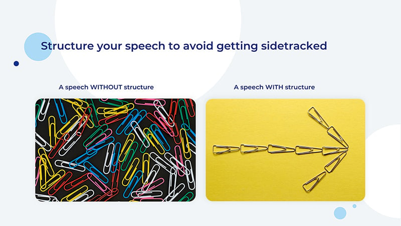
So, how do you structure a presentation? Consider both the logical and emotional implications of your structure. First, you want to give your listeners enough background information to help them get better acquainted with the topic, but not so much as to get them bored. Once all the need-to-knows are out of the way, make a seamless transition to your main message and start laying out your arguments in a convincing way.
Also, think about the emotional effect you want to achieve in each part of your presentation. The best way to go about it is to capture your audience’s attention right off the bat, which is often considered to be the hardest part of giving a presentation.
“How do I begin a presentation?” is a question you’ve surely asked yourself. Once you’re done introducing yourself, you can jump into the presentation with a story or an intriguing question. Then, build suspense throughout the speech and release it at the end with a well-grounded closing statement.

Tell a Story
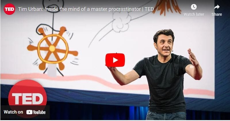
How do you present a topic? As human beings, we’re attracted to stories. This is why we go to the movies, read fiction and, yes, become all ears when hearing gossip. Thus, it’s always a good idea to begin your presentation with a story or even spice it up with one in the middle. This can make all the difference between an engaged and indifferent audience.
Need some proof? Watch this TED talk and see how the presenter wins the audience over in less than 3 minutes using the magic of a personal story (admittedly, a relatable one).
Keep a Conversational Tone
Many first-time public speakers try a bit too hard to make their speech expressive. As a result, their presentations appear showy and even pompous to the audience.
To prevent this, simply use a conversational tone. Feel like you are communicating your message to individual people, rather than a large alien audience. This will not only ease you up but will help the audience connect to you as well.
After all, when you really look at it, you are talking to individual people, not their aggregation.
Remember the Takeaway
What is the one thing you’d wish the audience to take away from your speech as they leave the room or the auditorium? Define it in a single phrase or sentence, using straightforward, accessible language, and present it at the end of your presentation. Keep that takeaway in mind when planning your speech, and put a special emphasis on it during the wrap-up.
Source: TED talk by Angela Lee Duckworth
Time your speech.
There’s probably a specific timeframe within which you should complete your speech. Even if it’s not rigidly set, the audience will have certain expectations as to how long your presentation will take.
Therefore, it’s important to plan beforehand the approximate time your speech should take and set a timer during rehearsals. If your presentation lasts longer than expected, make sure to leave the inessential parts out.
As you memorize your material, your speech will get smoother and faster. This will also shorten the time required for it. Thus, before making any adjustments to the length of your script, rehearse it a few times.

Do Your Rehearsals
Practice your speech as many times as necessary to build confidence. This is not to say you should memorize every single word or sentence, but you should know exactly what you need to cover at every point.
When you’re confident enough about your speech, there’s one less reason to be nervous during the presentation. You can now relax and focus on building rapport with your audience.
- 100+ Creative Presentation Ideas
- Best Presentation Software: Ultimate List
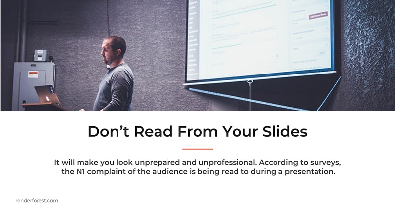
Perhaps, the worst thing you can do during a presentation is to read your script. Even glancing at a paper or screen far too many times is distracting enough. What’s more, your audience will find it difficult to connect to your message, as it will all feel mechanical and staged.
The solution? It’s fairly simple: rehearse, rehearse, rehearse.
Don’t Rely on Slides
A slide should never be the main source of information for the audience. Use it as a mere extension that makes your speech more engaging or credible. Always keep in mind that your audience needs to learn from you , the speaker, not from your slide.
It goes without saying that you shouldn’t stuff any slide with text. Or include so much information (whether textual or visual) that your audience gets overwhelmed and stops following your speech. When it comes to slide design, minimalism is your best friend.
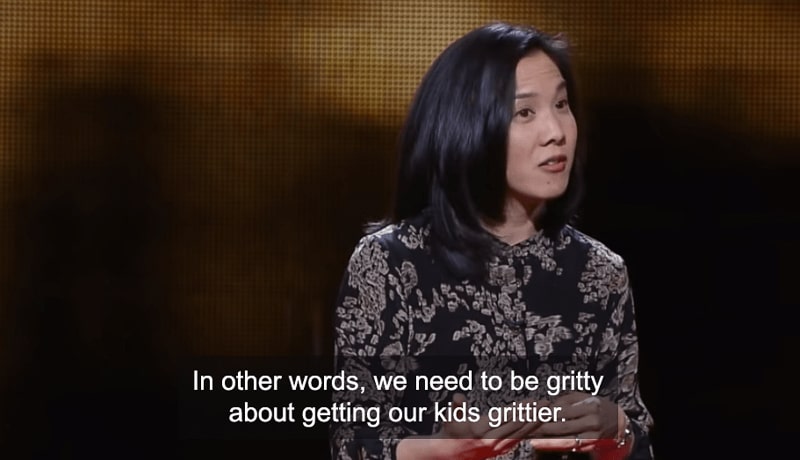
To know if you’re relying heavily on your slides or not, ask yourself this question: “Will my presentation still make sense without the slides?” If the answer’s no, then you should rethink your script. But, there’s also a fun side to this. When you free your slides of the burden to inform, they can now be used creatively and even enhance the effect of your speech.
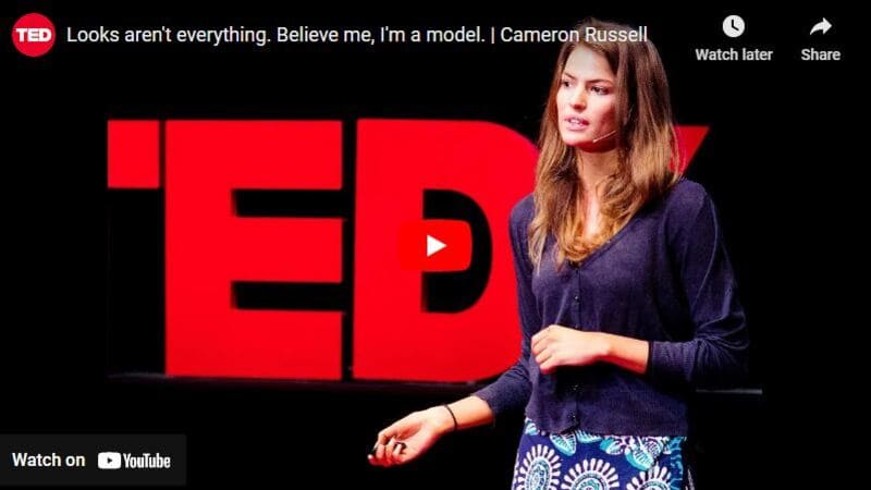
Notice how the presenter in the video shown above only turns to slides to highlight or demonstrate a point she made. And if you remove all the slides? The presentation will be just as complete and impactful.
Don’t Use Fancy Slideshows
How a good presentation should look like? Nowadays, there are lots of advanced presentation software and screen-sharing tools one can use to “wow” the audience. The problem with them? “Wowing” your audience with something as trivial as slides is hardly why you’re making your speech. The fewer distractions there are in your presentation, the better. Keep this in mind, and avoid using anything showy.
Don’t Talk Too Fast (or Slow)
While presenting, it’s recommended to maintain a consistent pace that’s neither too fast nor too slow. Talking fast might cause unnecessary tension in the audience, and excessively slow speech is sure to annoy them.
While different people naturally speak at different paces, it’s still something that can be worked on and modified with enough practice. You can refine your pacing during rehearsals until the preferred pace is second nature to you.

Don’t Forget Backup Slides
You’re about to start your presentation, but the internet connection is too slow, and your slides won’t load. On top of it, you didn’t follow our advice about not relying on slideshows. What do you do?
Well, if you’re considerate enough, you will have a USB flash drive with backup slides. Next time you feel like forgoing this little step, recall this scenario.
Don’t Neglect Body Language
The way you move your body on stage tells a story. And if that story is incoherent with the one you’re telling with your words, disharmony arises. Imagine a speaker is talking about peace and tolerance, yet their every movement is abrupt, hasty, and aggressive. Sure, this might be the result of nervousness, but would you still be able to connect to their message? The answer’s likely to be no.
When rehearsing your speech, don’t neglect body language. Practice standing tall, keeping your hands open, and your movements relaxed. Avoid pacing on the stage during your presentation, as it may distract or, worse yet, annoy your listeners.
Check out this TED talk by Emily Esfahani Smith. Pay attention to how her empathetic facial expressions and open hand gestures help to reinforce her message.

And, of course, don’t skip eye contact. Instead of glancing over the entire audience, pick a few individuals from different parts of the room, and establish your eye contact with them. This little trick will help you feel like you’re speaking to one person at a time. And that’s far more manageable than speaking to everyone at once.
To emphasize a point, sometimes, what you need is not words but their absence. Take a pause after you ask a question or make a strong statement. Spare your audience a moment to think, reflect, and ponder. Or leave a gap of silence right before you present something exciting to build suspense and anticipation.
No one expects you to go on talking for 10-15 minutes without a pause. Take a few seconds once in a while to breathe. Draw in deep breaths to collect your thoughts and calm your nerves if the situation calls for it. This is one of the most effective ways to relax when presenting.
These were the things good presentations include. Hopefully, you’ve learned enough from our tips and are now ready to get to work. Delivering effective presentations is not an easy task, but definitely, one that’s worth the effort. If you’d like to create a presentation for your speech or even online platforms, give these customizable templates a try.
More Templates
Dive into our Forestblog of exclusive interviews, handy tutorials and interesting articles published every week!
Create Professional
Presentations, Graphics, Videos, and more
with Renderforest All-In-One Branding Platform.

The 13 best Placeit alternatives
12 min read
23 Aug 2024
The best video editing software for YouTube in 2024

The best video presentation software of 2024
14 min read
22 Aug 2024

- Presentation Design
Presentation Do’s and Don’ts: What You Need to Know
Camille del Rosario

Giving a presentation can be a nerve-wracking experience, especially if you’re not fond of public speaking. Luckily, there are ways you can improve your talk and give maximum value to your listeners. Your public speaking skills — like speaking clearly and minding your body language — are important. But you also have to complement this with good and effective presentation design .
There are a lot of things that you can do to improve your presentation design and delivery method, from using attention-grabbing images and PowerPoint graphics to enhancing interactivity with the audience. In this article, we list all the important do’s and don’ts when giving a presentation to amplify the value that listeners will get from your pitch.

Presentation Do’s
1. plan the structure.
You might have a lot of information you want to share with your audience. The first part of your preparation should be planning your structure.

- You can’t deliver a huge load of information at once, so create an organized guide for you to follow throughout your talk.
- Start with providing your listeners with background information about you and the topic.
- Next, highlight your main message or key point and then supplement it with data-based arguments backed by verified sources.
- Finally, plan your concluding thoughts or CTA to maximize your presentation’s impact.
With all the points that you need to make, it’s easy to get sidetracked and lose your train of thought. If there’s one thing you can take away from these tips, it’s to never give a presentation unprepared.

2. Use the Rule of Thirds
Have you ever seen a presentation deck so rife with information that it becomes too much? There’s a reason minimalism is good practice when designing your slides. If there are too many things going on on your presentation deck, you run the risk of distracting your listeners and overloading their brains with too much information.

Generally, you should keep it simple by using centered or symmetrical layouts. But sometimes, your content doesn’t allow for a strictly symmetrical layout. Your slide may end up looking unbalanced or unfinished.
Using the rule of thirds is a good principle to counter that. Imagine that your slide is divided into three equal parts vertically and horizontally. Place text, images, or other objects on each section of the grid to make the slide as balanced and aesthetically pleasing as possible. This helps you align the objects in your deck in a way that’s easy on the eyes and gives room for white space.
3. Use Negative Space Generously
Negative space is the “blank” part of a design — no elements whatsoever. But just because they’re blank doesn’t mean they don’t serve a purpose. Negative space, also known as white space, is an important functional element of your design. They help clear up the layout so that the audience’s eyes are drawn only to the most important parts.

Using negative space will greatly improve your audience’s ability to absorb and retain information. It’s a common beginner design mistake to fill up every corner with text and graphics, but don’t give in to the temptation!
4. Think Twice When Choosing Stock Photos
Overcrowded layouts and big blocks of text are off-putting for audiences. If you saw walls of text in a PowerPoint presentation, most likely, you wouldn’t be motivated to read every single line from start to finish. That’s why you need to add attention-grabbing visuals.

When adding visuals to your presentation, stock photos are a good resource. But make sure that you maintain a selective attitude when using them. Instead of settling with the first photo that pops up after a query, conduct a more specific search and find photos that are relevant to your topic.
Images have been shown to increase retention by up to 24%, so adding them to your presentation will keep your listeners engaged. Try to keep the text as minimal as possible and instead incorporate more images or visuals that are captivating, high-resolution, and relevant to your presentation.
5. Choose Your Fonts & Colors Carefully
The fonts and colors you use in your presentation deck can make or break its ability to engage your audience and provide important information. In line with keeping your slides simple, choose fonts that are readable and use only colors that are easy on the eye.

Make sure your color choices are on-brand — or at the very least, relevant to your topic. Pastel colors and monochromatic palettes are a trendy choice these days. So are neon elements on dark backgrounds. But as long as they provide enough clarity and contrast, it’s totally your choice!
When it comes to fonts, go for the simplest choices. But your font doesn’t have to be boring! A great way to tell if a font is appropriate for a presentation is to do a size test. If a font is easy to read at a very small size, then it’s workable. (But that’s just a test — in your actual presentation, remember to keep your font sizes big and friendly!)
6. Let Your Passion Shine Through with Storytelling and a Conversational Tone
Even if you’re speaking about a formal or technical topic, it doesn’t mean that you can’t be casual in your presentation. People appreciate listening to someone who’s human and who they can relate to, making story-telling a valuable skill in public speaking. Stories also help people retain information better!

Engage your audience by telling a story that’s related to your main point. You can start your presentation with a backstory or capture attention halfway through. And while you’re story-telling and providing value to your audience, make sure that you’re showing them how interested and passionate you are about the topic at hand.
7. Use Audience Engagement Strategies
As much as possible, you want to keep your audience engaged from start to finish. Aside from adopting the best practices in speech delivery and presentation design, you may also want to make your talk more interactive. Here are a few ways you can do this:
- Involve your audience in the conversation. Ask them questions every couple of minutes or tell a short story or two to keep their eyes and ears on you.
- Make eye contact with your audience and pay attention to your own nonverbal cues like gestures, posture, and facial expression.
- Rehearse and time your speech. It’s easy to lose track of time during a presentation, so make sure you know how much of your audience’s time you’re taking by conducting a timed rehearsal. As a bonus, this will also help you gain clarity about the flow of your talk or even help you anticipate questions and reactions.

Information is not hard to come by, especially in the digital age. Your audience can easily get access to and learn about the topics you’re going to talk about from other resources. So what makes your presentation special? In the end, there’s still nothing that can compare to hearing it from a professional who can deliver this information in a more intimate and engaging manner.
8. End Your Presentation With a Key Question or Call to Action
You can’t always guarantee that your audience will remember everything you discussed in your presentation. So it’s important that you identify your main point — the one thing that you want to leave your audience with.

So before presenting, make sure you’ve identified “the one idea to rule them all.” Summarize what you discussed in a single statement, which can be in the form of an insight, question, or action. Doing this will get your audience thinking and allow them to appreciate what your presentation was really about.

Presentation Don’ts
1. don’t use too much text.
You’re not writing a book — your slides are meant to be observed for several seconds with minimal effort from the viewer. You have a limited hold on your audience’s attention. Don’t risk being boring via information overload and keep text at a minimum.

For more complex information, use short sentences divided into three to five bullet points per slide. You can also use data visualizers like charts and graphs, but remember to simplify these as well by only using a few variables at a time.
And if you really want to provide lengthy content, consider providing your audience with presentation aids like printed handouts or links to digital documents that they can study at their leisure after your presentation.
2. Don’t Just Read the Slides Out Loud
If your slides contain absolutely everything you want your audience to know, then what are you there for? Trust us — you don’t want your audience sitting there thinking, “This could have been an email.” Make the most of their time by making your presence valuable.

Giving a presentation is more than just about relaying information. It’s also about engaging with your audience by provoking wonder, emotion, interest, and action. Your presence is needed to lend credibility and authenticity to the information you’ll provide. So refrain from reading your slides out loud! You’re a human talking to humans. Make your front-and-center moment matter.
3. Don’t Talk Too Fast or Too Slow
If you’ve ever attended a talk where the speaker spoke too fast, you were probably tense the whole time only to end up without a single takeaway from the presentation. Or if the speaker spoke too slowly, you might have found yourself dozing off halfway through.

Speak at a moderate, conversational speed to help your audience understand you clearly. Don’t forget to modulate your pitch and volume. It’s okay to get excited — but don’t let emotion get in the way of your delivery. Even when you’re at your most passionate, avoid bellowing, screeching, or whispering.
Basically, clear speech is a matter of avoiding all extremes. You can do it with practice, practice, practice!
4. Don’t Overuse Charts and Graphs
Charts and graphs are valuable visual cues that help you express important numbers or statistics — but there is such a thing as overusing them. Sure, your audience will be able to absorb information from one to two charts, but if you use them more than ten times in your entire presentation, for example, the chances of your audience being able to understand and retain that information are slim.

Again, if you really think your audience should have a truckload of information at hand, then email or print out the relevant documents for them. If you manage to capture their genuine interest during your simplified presentation, they are more likely to seek out additional information later on.
5. Don’t Use Hard-to-Read Fonts
Your audience will rely on your presentation to guide them through understanding the topic you’re discussing. Make sure that your points are readable and clearly state the key points. You don’t have to use the most aesthetic font available. Stick to basic and easy-to-read options.

Broken fonts can really ruin a presentation, so here’s a little secret. For maximum portability, use easily accessible web fonts like Google Fonts . This way, you’ll be able to have access to them no matter what device you use to present — all you need is an internet connection.
6. Don’t Use a Low-Contrast Color Palette
Contrast is one of the main principles of design. It can be expressed in different ways — through size, shape, texture, and most commonly, color. Contrast helps establish hierarchy, effectively informing viewers what they are looking at.

With low contrast, it’s difficult to tell the difference between two colors that are side by side. The highest contrast possible is black and white, which is why many presentations simply use black text on white backgrounds (or vice versa).
But plain black and white presentations can get really old, really fast. Using a more diverse color palette will add interest to your presentations. Just make sure to amp up the contrast by using dark colors on light colors and light colors on dark colors.
7. Don’t Use Too Many Effects
One of the exciting features of presentation software is your ability to add transition effects to your slides. While these were fun in high school, they’re not necessarily at home in formal pitch decks and corporate presentations.

Using too many effects can distract your audience and deter them from absorbing the more important points of your presentation. Keep the dazzling effects to a minimum and make your slides as simple as possible.
8. Don’t Use Irrelevant and Low-Resolution Images
Stock or custom images are a very good way to keep your audience engaged, but you have to make sure to use good-quality images that are actually relevant to the topic at hand.

Using blurry, pixelated, or low-quality photos will set you up for a negative impression. And irrelevant images make it pretty obvious that you didn’t spend enough time on your deck. Weird or off-topic image choices can really impact your credibility. Fortunately, there are loads of creative resources available online today, many of them free or affordable.
Ready to Put Your Presenter Hat On?
These tips will definitely help you position yourself as an expert in your subject matter. You don’t need to be a graphic designer to create truly engaging presentations that are easy on the eye.
But we know that the fear of public speaking is one of the most common phobias — this means that for most people, having to design and present slideshows can feel like a little too much work! So if you need a boost, we’re here to help. With Design Pickle’s Presentation Design services, you can win over your audience with engaging, well-designed, and on-brand presentation designs that stand out from the competition. No sweat!
Related Posts

10 Types of Motion Graphics You Can Create With Design Pickle

10 Types of Graphic Design to Help You Get the Content You Need

How to Design a Presentation
Sign up for email, get the inside scoop on creative leadership and killer campaigns.
Hosted by Russ Perry, CEO & Founder of Design Pickle, Jar of Genius is a podcast that uncovers the strategies and mindsets of today’s most innovative creative leaders. Get actionable insights on groundbreaking business models, successful campaigns, and the cutting-edge tech that’s changing the game. Learn how to build a thriving creative business in this fast-paced world.

Simplify the way your design work gets done.
We’re an all-in-one platform with a built-in global design workforce , trailblazing the path to easier, faster, and more efficient creative .

- Designer Application
- Referral Program
- Graphic Design
- Custom Illustrations
- Motion Graphics
- Video Editing
Contact Sales & Support
- +1 877 331 1272
- +61 4 8000 8268
Design Samples
Request a demo, help center.
- Terms & Conditions
- Privacy Policy
- System Status
- Product Updates

Presentation Training Institute
A division of bold new directions training, the do’s and don’ts of using powerpoint.
Slideshows are a quick, easy, and effective way to inject visual interest into a presentation. However, they can also be the kiss of death even for the most seasoned presenter. The key to a successful PowerPoint is to make sure your slideshow acts as a visual aid and not a visual distraction. It should also be used only to supplement what the presenter is saying. Here we will take a look at some of the do’s and don’ts of an effective PowerPoint presentation.Â
DO: Keep it Concise
The biggest mistake most people make when creating a slideshow is to paste all of their information verbatim onto the slides. Not only is this incredibly boring, but no one has the desire to read all of that text. The general rule of thumb is to limit yourself to five words per line and no more than five lines per slide.Â
DON’T: Use Special Effects
It can be tempting to add all of the bells and whistles to your PowerPoint but this often ends doing more harm than good. Transitions and sound effects can become the focus of attention, and this distracts the audience from your actual message. It’s best to leave out the fade-ins, fade-outs, wipes, checkerboards, dissolves, splits, and other special effects. Focus on your message and not these fancy add-ons.Â
DO: Look Up!
Even if you are referencing the information on your slides, you should still look up and maintain eye contact with your audience. This is important for engagement.Â
DON’T: Read the Slides
Your audience can read on their own and the last thing they want is for you to read every word to them. Your slides should only be used to support your oral presentation, not as a script.Â
DO: Use Bullets and Numbered Lists
People process information better when it’s organized into parts. Break down your information into sections and then break those down into smaller subsections. Make sure the information flows in an orderly fashion and is easy to understand. Progressively released bullets (that pop up one at a time) can be useful for helping the audience keep track of where you are and they also prevent them from reading ahead.Â
DON’T: Use Standard Clipart
The clipart included with PowerPoint has been so overused that it shows a lack of creativity and can really downplay your slideshow. You are better off sticking with a simple design and avoiding graphics but if you do choose to add graphics, go with high-quality photographs or custom graphics that will enhance your message.Â
DO: Use Data Sparingly
Creating a slide with significant amounts of data can overwhelm your audience. It is more beneficial to add contextual information that your viewers can more easily understand that dense, data-focused slides.
Prezentt Blog
The do’s and don’ts when giving a powerpoint presentation.
By Lauren Clarke
One of the most useful skills to have in life is the ability to stand on stage, in front of the audience and give a great presentation.
However, even experienced presenters tend to make the some rookie mistakes when giving a PowerPoint presentation.
To avoid making such mistakes, we have compiled some simple tips – the dos and the don’ts when giving a PowerPoint presentation.
Prepare, Prepare, Prepare
We cannot over-emphasise how important preparation is when giving a PowerPoint presentation. Know your topic that you are delivering, forwards and backwards. Write down the major points that you want to deliver to your audience on your slides as well as on your cue cards. By doing so, the chances of you digressing into other topics are very slim.
Start off your PowerPoint presentation with a catchy introduction to get your audience interested or even curious about your topic of presentation. Get them engaged and wanting to stay on to find out more about the rest of the topic that you will be presenting.
Once you have the audience’s attention, keep the momentum going by branching out from your introduction. Avoid reading and looking at your slides all the time and try to engage your audience by asking closed questions that require the audience to reply by a show of hands. You could also include your personal experiences relating to your topic of presentation; who does not like to listen to real life events! End your presentation with a great wrap-up and a summary of your presentation. Do include your contact details for those audiences who want to know more or have questions for you.
Another way to get organised for your presentation is by using Prezentt. Upload your slides and content and remember to share the link with your audience on the day of the presentation. By sharing your slides in real time with your audience, they will be more engaged in your presentation. Not only that, you will save countless hours of administration time and cost, and will effortlessly improve the interaction between you and your audience.
Posture and Body Language
How you present yourself in front of the audience says a lot about you and your personality. From your posture and body language, the audience will roughly know how dull and boring or how exciting and full of zest your presentation will be. Your body language is an essential tool of any public speaking.
Stand up straight, avoid slouching and regardless if you are using a microphone or not, always speak with clarity. Try to make eye contact with audience members during your presentation to increase audience engagement.
Pace Yourself
It is very common to have the moderator or event manager informing you on how long your presentation should be when giving a PowerPoint presentation. Normally, you will be informed prior to the presentation date as you will need to prepare your slides and get organised. With the time allocated to you, try to pace yourself and avoid pacing aimlessly. Eventually, the audience will focus on your movement instead of your presentation.
Do not speak so quickly that the audience cannot comprehend what you have just said, but don’t speak so slowly that your audience falls asleep or walks out of the room either!
Try Prezentt for Free
Get started with a no-obligation demo!
Request DEMO
Ineffective Slides and Visuals
Poorly prepared slides can ruin a good PowerPoint presentation, so it is worth the time and effort in getting your slides right. The most effective presentation visuals do not have to be flashy, they just have to be brief and consistent.
Avoid cluttering your slides with text in tiny font sizes. It is a waste of time when your audience is not able to read your slides if you use font size 12 or when your slides contain too many words. Also, do not use animation like an animated emoji or a dancing clown, as it will only distract your audience.
Ignore the Audience
If you think that giving a PowerPoint presentation is all about you, you might need to rethink your priorities. Do not ignore the audience and always remember why they are there in the first place. Without the audience, you would end up giving your presentation to an empty room!
Ignoring the audience happens sometimes when speakers are afraid or have stage fright – they just want to get the presentation over and done with! They rush through the presentation and don’t deliver their message effectively. Pay attention to your audience and they will listen to you.

Read your Slides Out Loud
Have you ever seen an actor on stage performing while holding a script in his hand?
Ideally, a presenter won’t simply read out the entire presentation from their notes but you may find it useful to use Cue Cards, just in case you lose your chain of thought.
What you should not be doing is reading your slides out loud, word for word. You audience can read your slides clearly, so what is the point in giving a presentation to your audience if you are going to read your presentation from your slides? It sends a message to your audience that you are lazy in preparing your slides and you don’t really know your topic. If you are familiar with the flow and content of your presentation, you won’t be reading the slides.
In addition, if you’re simply reading the slides from your PowerPoint presentation, you’ll end up having your back facing the audience most of the time. This is a big mistake. The audience wants to see your face and not your back so this is very distracting. Remember that presentation slides are meant to improve your talk!
While there are plenty of other dos and don’ts when giving a PowerPoint presentation, this is a short list of the basic ones which you should be able to implement when giving your next presentation.
Remember that when giving any kind of presentation, it all comes down to one thing: valuing your audience and being worthy of their time. When you continue to focus on providing the best to your audience, you will find yourself giving a great presentation every single time.
Leave a Reply Cancel reply
You must be logged in to post a comment.

Elevate Your Presentations: Mastering the Art of Dynamic PPT Design for Impactful Delivery
PPT designs are critical for businesses and professionals to communicate their ideas, products, and services. A well-designed presentation can help you engage your audience, persuade them to act, and achieve your goals. However, creating a successful PowerPoint presentation requires careful planning, thoughtful design, and attention to detail. In this post, we’ll cover the dos and don’ts of PPT design to help you create compelling and engaging presentations.
Why is presentation design critical?
Before understanding the dos and don’ts of ppt design, we need to understand why presentation design is critical because it significantly impacts the effectiveness and impact of your message.

Here are a few reasons why presentation design plays a crucial role:
- Visual Appeal: A well-designed presentation captivates the audience and grabs their attention. Visual elements such as color schemes, typography, images, and layout contribute to the overall aesthetics of the presentation, making it visually appealing and engaging.
- Enhances Understanding: Effective presentation design helps convey complex information clearly and concisely. Well-structured slides, visual cues, and graphical representations can make it easier for the audience to understand and retain the key points of your message.
- Supports Storytelling: Presentation design helps to tell a compelling story. Through the strategic use of visuals, text, and animations, you can create a narrative flow that guides the audience through your content, making it more memorable and impactful.
- Builds Credibility and Professionalism: A well-designed presentation reflects your professionalism and attention to detail. It enhances your credibility as a speaker and creates a positive impression on the audience, signaling that you have put effort into crafting a high-quality presentation.
- Engages the Audience: Effective presentation design keeps the audience engaged and focused. Visual elements, such as eye-catching images, infographics, or videos, can evoke emotions and connect with the audience, increasing their interest and involvement in your presentation.
- Emphasizes Key Points: Design elements can be used to highlight and emphasize important information or key messages. Strategic use of color, font size, and visual hierarchy draws attention to critical content, ensuring that your key points are effectively communicated and remembered.
- Facilitates Retention: A well-designed presentation enhances information retention. People remember visuals more effectively than text alone. By incorporating visuals, diagrams, and other graphical elements, you can help the audience better understand and retain the information you present.
- Supports Branding: Presentation design provides an opportunity to reinforce your brand identity. You can create a cohesive and recognizable visual identity that aligns with your brand image by using consistent brand colors, fonts, and imagery.
Let us now understand the dos and don’ts of ppt design that can affect your presentation significantly.
Here is the list of dos and don’ts of ppt design:

The Dos of PPT Designing:
- Define your objective : Before starting your PPT designing process, define your presentation’s objective. Determine what you want to achieve with your production and the audience’s needs, preferences, and pain points.
- Keep it simple : Use straightforward language, avoid jargon, and keep your presentation visually clean and uncluttered. Use only essential text and images to convey your message, and avoid using too many animations, transitions, or effects that distract your audience.
- Use high-quality images : Images are a powerful way to communicate your message, emotions, and ideas. Use high-quality and relevant images that support your message, and avoid using low-resolution, stock photos or generic images.
- Use consistent design : Consistency is crucial in PPT design. Use the same font, color scheme, and design elements throughout your presentation. This creates a cohesive and professional-looking presentation and helps your audience focus on your message. Understanding the presentation dos and don’ts will give better insights and help in enhancing the overall presentation.
- Use charts & graphs : Use charts, graphs, and diagrams to convey complex data or statistics in a visually appealing and easy-to-understand way. This helps your audience grasp your message quickly and also supports your credibility.
- Proofread and edit: Avoid spelling and grammatical mistakes by thoroughly proofreading and editing your slides.
- Test your presentation: Run a test presentation to ensure everything displays correctly and smoothly.
The above-mentioned are a few dos in PowerPoint presentations that should be considered and implemented to improve the effectiveness and engagement of your presentation.
The Don’ts of PPT Designing:
Now let us look in-depth into the Don’ts of PPT Design

- Use only a few bullet points : Bullet points help summarize information, but too many can overwhelm your audience and make your presentation boring. Use bullet points sparingly, and focus on the essential issues.
- Use only a few fonts or colors : Using too many fonts or colors can make your presentation look more cohesive and professional. Stick to one or two fonts and a color scheme that complements your brand identity and supports your message.
- Don’t use too many animations : Animations can add visual interest to your presentation, but too many can distract your audience and make your presentation look childish. Use animations sparingly and only when necessary to support your message.
- Don’t use copyrighted images : Using copyrighted images without permission can lead to legal trouble and damage your reputation. Use only photographs you have the rights to or licensed under Creative Commons.
- Don’t read your slides : They should support your message, not replace them. Avoid reading your slides verbatim and use them to guide your presentation. Engage your audience with eye contact, body language, and storytelling.
These dos and don’ts of ppt designs are to be considered to ensure that the content reaches the audience effectively and is kept engaging.
You can also check the do’s and don’ts ppt template free download . Also, there are multiple do’s don ts formats available on the internet that you can utilize to enhance your overall quality.
Here are a few tips to improve your presentation skills:
It is necessary to consider several other parameters mentioned below, along with the dos and don’ts of ppt, so as to improve the overall content relevance and effectivity.

- Know your audience: Understand your audience and consider their level of knowledge, interests, and expectations.
- Body language is the key: Maintaining good posture, making eye contact with your audience, and using hand gestures will improve the overall effectiveness of your presentation.
- Engage with the audience: Interacting with the audience and involving them will create a great atmosphere, and you will understand how well they grasp the content.
- Practice thoroughly: Rehearse your presentation multiple times to become familiar with the content and delivery. Practice in front of a mirror, record yourself or present it before your colleagues or friends and ask for feedback.
Remember, a well-designed and well-delivered PowerPoint presentation can effectively convey your message and engage your audience.
These tips become effective if you thoroughly understand the dos and don’ts of ppt design and implement them together.
Effectiveness of verbal communication in PowerPoint presentation:

Along with the dos and don’ts of ppt design, here are some key points to consider for enhancing the effectiveness of verbal communication during a PowerPoint presentation:
- Clarity and Enunciation: Speak clearly and enunciate your words to ensure your audience understands you. Pay attention to your pronunciation, and articulate your words with proper emphasis. Avoid speaking too fast, making it difficult for the audience to follow your message.
- Tone and Inflection: It is a good practice to vary your tone and inflection to keep your audience engaged and interested. Use a conversational and engaging tone to create a connection with your audience. Emphasize key points, use appropriate pauses, and modulate your voice to convey enthusiasm and the importance of your message.
- Eye Contact: Maintain eye contact with your audience to establish a connection and build trust. Look at different sections of the room and make eye contact with individuals to create a sense of engagement. Avoid solely focusing on your slides or notes, as it can create a disengaged atmosphere.
- Body Language: In addition to understanding the dos and don’ts of PPT design, your body language can greatly impact how your message is received. Stand tall, maintain an open and confident posture, and use appropriate gestures to support your verbal communication. Non-verbal cues such as facial expressions and hand movements can help convey emotions and engage the audience.
- Engagement and Interaction: Encourage audience participation and engagement throughout your presentation. Pose questions, ask for opinions, or encourage discussion to involve the audience in the topic. This keeps the audience actively engaged and helps create a more interactive and dynamic presentation.
- Pace and Timing: Along with the dos and don’ts of ppt, paying attention to the pace and timing of your speech is necessary. Speak at a moderate pace, allowing the audience to process the information. Avoid rushing through the content or speaking too slowly. Use pauses effectively to emphasize important points, give the audience time to absorb information, and create a sense of anticipation.
- Adaptability: Be adaptable and responsive to your audience’s reactions and feedback. Pay attention to their level of understanding and engagement. Adjust your communication style, provide additional explanations, or clarify any points to ensure effective comprehension and engagement.
- Confidence and Authenticity: Project confidence and authenticity in your delivery. Believe in your message and express it with conviction. Be genuine and authentic in your communication, allowing your personality to shine. This will help you establish credibility and connect with your audience more deeply.
Remember, effective verbal communication in a PowerPoint presentation combines clear and articulate speech, engaging delivery, audience interaction, and adaptability. By focusing on these aspects, you can enhance the impact of your verbal communication and deliver a successful presentation.
These points, if considered along with the dos and don’ts of ppt design, will surely improve the overall power point presentation and can keep the audience engaged throughout.

In conclusion, PPT designing requires a strategic approach, creativity, and attention to detail. Following the dos and don’ts of PPT design, you can create practical and engaging presentations that help you achieve your objectives and connect with your audience. A well-designed PPT with good presentation skills will help in delivering the content effectively.
Hit enter to search or ESC to close
Presenting with PowerPoint: 10 dos and don'ts

Introduction
Welcome to Beyond Digital Graphix, your go-to source for all things related to visual arts and design! In this article, we will dive into the art of presenting with PowerPoint, specifically exploring the top 10 dos and don'ts. Whether you are a seasoned presenter or just starting out, these tips and tricks will help you create impactful and engaging PowerPoint presentations.
1. Do Keep It Simple
When it comes to PowerPoint presentations, simplicity is key. Avoid overcrowding your slides with too much text or complex graphics. Instead, focus on conveying your message in a clear and concise manner. Use bullet points, short sentences, and visually appealing images to enhance understanding and retention.
2. Don't Overload with Information
While it is important to provide valuable information, overwhelming your audience with an excessive amount of content can be counterproductive. Stick to the main points, highlighting key ideas and concepts. If necessary, provide additional information in handouts or accompanying materials.
3. Do Use High-Quality Visuals
Visuals play a crucial role in capturing and maintaining audience attention. Choose high-quality images, charts, and graphs that are relevant to your content. Use appropriate colors, fonts, and other design elements to create a visually appealing and cohesive presentation.
4. Don't Rely Solely on Text
Avoid turning your presentation into a text-filled document. Instead, use visuals, videos, and animations to support your message. Visual aids not only make your presentation more engaging but also help your audience understand complex concepts more easily.
5. Do Practice and Prepare
Practice makes perfect! Rehearse your presentation multiple times to ensure a smooth delivery. Familiarize yourself with the content, transitions, and timing. Prepare additional materials such as speaker notes or cue cards to help you stay on track.
6. Don't Read Directly from Slides
One common mistake presenters make is reading directly from their slides. Remember, your slides are there to support your presentation, not to be your script. Use them as visual prompts, and speak conversationally to engage your audience.
7. Do Engage with Your Audience
Connecting with your audience is essential for a successful presentation. Encourage participation through questions, interactive activities, or thought-provoking statements. Maintain eye contact, speak clearly, and adapt your tone to match the topic and audience demographics.
8. Don't Overuse Transitions and Animations
While transitions and animations can add visual interest to your presentation, be cautious not to overdo them. Too many fancy effects can distract your audience and take away from the core content. Use transitions and animations sparingly, ensuring they enhance rather than hinder your message.
9. Do Rehearse for Technical Glitches
Technical glitches happen to the best of us. Be prepared by rehearsing your presentation with the equipment you will be using. Test your slides, multimedia elements, and any other technical aspects to ensure everything runs smoothly during your actual presentation.
10. Don't Neglect the Power of Storytelling
Effective presentations often incorporate storytelling elements to engage and captivate the audience. Weave narratives, anecdotes, or case studies into your presentation to create an emotional connection and make your content memorable. Use storytelling to illustrate your main points and leave a lasting impression.
Mastering the art of presenting with PowerPoint requires practice, preparation, and attention to detail. By following these 10 dos and don'ts, you can create impactful and visually appealing presentations that engage, inform, and inspire your audience. For more tips and tricks, visit Beyond Digital Graphix, your trusted resource for arts and entertainment in the realm of visual arts and design.

The Future is Now with Open AI ChatGPT-Powered

John Domanico, Hercules Chemical Co., Inc.

Microsoft Commitment to AI

eMazzanti Technologies Provides Earthly IT Solutions for Heaven Cause

Azure & Cloud Backup Hands On Immersion Workshop

2016 Hurricane Season Most Costly, Deadly Since 2012

Microsoft Teams | Chat, Meetings, Calling, Collaboration

Technology Newsletter - July 2015

IT Channel Sales Cycle: How to Close a Sales Deal More Quickly

5 Business Benefits of Gratitude
10 dos and don’ts of using Microsoft PowerPoint for a presentation
By: Cathie Briggette with lots of help from the US SMB Microsoft Team
PowerPoint can be both provocative and persuasive in a business meeting.
And exactly the opposite can occur.
PowerPoint can be the most awesome business presentation tool, or it can make you look absolutely awful. This two-sided view of Microsoft’s popular presentation and graphics program in Office 365 mirrors a debate coursing through business and academia. While many embrace the values of PowerPoint as a potent business tool, there are others who contend that it’s a drag on effective interaction—that it confuses, distorts, and even strangles communication.
Any discussion of PowerPoint’s merits and faults merely illustrates the importance of using the program to the best of its advantage.
Here are 10 ways to use PowerPoint to help make your presentation look brilliant, not brainless.
1. Use Compelling Material
In a way, PowerPoint’s ease of use may be its own worst enemy. However simple and engaging it can be to build eye-catching slides and graphics, bear in mind that PowerPoint isn’t self-sufficient. The audience has come to hear you, not to stare at images tossed onto a screen. Build a strong PowerPoint program, but make sure that your spoken remarks are just as compelling. “PowerPoint doesn’t give presentations—PowerPoint makes slides,” says Matt Thornhill, President of Audience First, a Midlothian, Va., business that offers presentation training. “Remember that you are creating slides to support a spoken presentation.”
2. Keep it simple...... (KISS)

3. Minimize numbers in slides
PowerPoint’s lure is the capacity to convey ideas and support a speaker’s remarks in a concise manner. That’s hard to do through a haze of numbers and statistics. For the most part, most effective PowerPoint displays don’t overwhelm viewers with too many figures and numbers. Instead, leave those for a later, more thorough digestion in handouts distributed at your presentation’s end. If you want to emphasize a statistic in PowerPoint, consider using a graphic or image to convey the point.
One of the most prevalent and damaging habits of PowerPoint users is to simply read the visual presentation to the audience. Not only is that redundant—short of using the clicker, why are you even there? —but it makes even the most visually appealing presentation boring to the bone. PowerPoint works best with spoken remarks that augment and discuss, rather than mimic, what’s on the screen. Make eye contact with your audience. These people didn’t come to this presentation to be read to. They came to hear about your topic and hear You.

6. Give it a rest
Unlike other products in Office 365 , PowerPoint is most effective as a visual accompaniment to the spoken word. Experienced PowerPoint users aren’t bashful about letting the screen go blank on occasion. Not only can that give your audience a visual break, it’s also effective to focus attention on a strictly verbally give and take, such as a group discussion or a question and answer session.
7. Use vibrant colors

8. Import other images and graphics
Don’t limit your presentation to what is offered. Use outside images and graphics for variety and visual appeal, including video , which is easy to embed in PowerPoint slides.
9. Distribute handouts at the end—not during the presentation
No speaker wants to be chatting to a crowd that’s busy reading a summary of his or her remarks. Unless it is imperative that people follow a handout while you’re presenting, wait until you’re done to distribute them.
10. Edit ruthlessly before presenting

Tags: Microsoft
Subscribe to our BLOG
Recent posts.
Free Do’s and Don’ts PowerPoint Template
Download free do’s and don’ts powerpoint template & google slides.
The Free Do’s and Don’ts PowerPoint Template is a presentation tool for comparison topics. These are two free slides of PowerPoint with four and five rows comparison presentation to choose from. This template is designed to display the do’s and don’ts of any project or process. For example, mistakes which should not be repeated or the guidelines which must be followed for smooth process flow. These free layouts of comparison tables enable users to list down positive and negative elements of business activity. Like clearly explaining the steps to take or not during an ongoing process.
The Free Do’s and Don’ts PowerPoint Template provides two contents layout with circular comparison graphic in the middle. This graphic shows 2 halves of circle to demonstrate two opposite. These could be the comparisons between right and wrong, pros and cons etc. Here, the green semi-circle contains a thumbs up icon and red has thumbs down. Because green color symbolically portrays positive, good, and affirmative action. While red is the color for danger, to display negatives or unacceptable terms. Further, the rows on both do’s and don’ts slide contain symbolic icons for bullet point representation. Such as green check marks under do’s and red cross mark under don’ts.
The free PowerPoint is useful in both business and casual presentation. Since users can add these slides to display acceptable behavior in a data table. For instance, listing healthy and unhealthy food items to present on social media. The editable PowerPoint template of do’s and don’ts includes a collection of icons, shapes, and text placeholders. The users can change colors and shapes for a personalized outlook. Like changing the shape style or adding special effects in format menu. The premium subscribers can take advantage of 4 slide do’s and don’ts PowerPoint template with assorted background template.
- 100% Editable PowerPoint Templates & Google Slides.
- Compatible with all major Microsoft PowerPoint versions, Keynote and Google Slides.
- Modern 16:9 Aspect Ratio.
- Scalable Vectorial PowerPoint Shapes and PowerPoint Icons.
- Instant Access and Download.
- New Templates every week.
Google Slides Preview
Our PowerPoint Templates are compatible with Google Slides. Take the most of every platform using the tool you like.

Newly Launched - AI Presentation Maker

- Dos and Donts
AI PPT Maker
Powerpoint Templates
Icon Bundle
Kpi Dashboard
Professional
Business Plans
Swot Analysis
Gantt Chart
Business Proposal
Marketing Plan
Project Management
Business Case
Business Model
Cyber Security
Business PPT
Digital Marketing
- Digital Transformation
Human Resources
Product Management
Artificial Intelligence
Company Profile
Acknowledgement PPT
PPT Presentation
Reports Brochures
One Page Pitch
Interview PPT
All Categories

Do and Don'ts PowerPoint Templates, Dos and Don'ts PPT Slides
- Sub Categories
- 30 60 90 Day Plan
- Advertising
- Agile Development
- Aims and Objectives
- Before and After
- Blockchain Bitcoin
- Celebrations
- Certificates
- Challenges Opportunities
- Channel Distribution
- Communication
- Competitive Landscape
- Construction Management
- Crowdfunding
- Current State Future State
- Custom PowerPoint Diagrams
- Environment
- Gap Analysis
- Geographical
- Input Process Output
- Key Messages
- People Process Technology
- Post-it-Notes
- Problem Statement
- Proposal Management
- Pros and Cons
- Recruitment Strategy
- Research and Development
- Risk Mitigation Strategies
- Short Term Long Term
- Start Stop Continue
- Thesis Defense Dissertation
- Transition Plan
- Transportation
- Venture Capital Funding
Presenting Dos And Don’ts Of Social Media Happy Sad Emoji Icon PowerPoint Slide. The template is available in PowerPoint and works in sync with Google Slides too. The slide is fully customizable. You can change the color of the slide’s background. Also, the font style, size and color can be changed. You can insert your text in the text holders provided. The name of your company and the official logo can also be added. The image has a good quality. The layout can be downloaded at the ease of a click.
Presenting problem solutions presentation template. This is a problem solutions presentation template. This is a two stage process. The stages in this process are problem solution, current state future state, before after, challenges solutions, compare, comparison.
This PPT presentation is very easy to use. You just have to follow the instructions given in the slides. You can easily save the template in PDF or JPG format. The shape, size and orientation can be easily altered as per the requirements of the presentation. The font size, font style and font color can be conveniently changed. The PPT slideshow can be viewed in widescreen or standard size in the ratio of 16:9 and 4:3 respectively. So just download our designs or upload them to Google Slides and they will work smoothly.
Presenting before versus after comparison 4 text boxes powerpoint graphics. This is a before versus after comparison 4 text boxes powerpoint graphics. This is a two stage process. The stages in this process are problem solution, current state future state, before after, challenges solutions, compare, comparison.
This PPT presentation is very easy to use as all you have to do is just follow the instructions given in the sample slides. You can easily save the template in PDF or JPG format. The shape, size and orientation can be easily altered as per the requirements of the presentation. The font size, font style and font color can be conveniently changed. The PPT slideshow can be viewed in widescreen or standard size in the ratio of 16:9 and 4:3 respectively. So just download our designs or upload them to Google Slides and they will work smoothly.
Presenting current state vs future state analysis powerpoint slide designs download. This is a current state vs future state analysis powerpoint slide designs download. This is a two stage process. The stages in this process are problem solution, current state future state, before after, challenges solutions, compare, comparison.
Presenting dos and donts comparison bullet powerpoint guide. This is a dos and donts comparison bullet powerpoint guide. This is a two stage process. The stages in this process are problem solution, current state future state, before after, challenges solutions, compare, comparison.
Presenting, dos and don’ts thumb up thumbs down PPT slide. Hassle free, simple and quick download. Completely modifiable text as per your need. Change the color scheme and contrast to suit the contextual requirement. Thoroughly editable orientation and size of PPT icons. Include your own company logo, tagline, watermark, trademark etc. to personalize. No alteration in original resolution of presentation images posts editing. Can be converted into pdf or jpeg format as per the need.
Introducing our premium set of slides with Dos And Donts Of Implementing Process Observation. Ellicudate the two stages and present information using this PPT slide. This is a completely adaptable PowerPoint template design that can be used to interpret topics like Do Model Respect Every Individual Behaviors, Do Ask Humble Inquiry Questions, Do Document And Review Observations. So download instantly and tailor it with your information.
Presenting current state and future state text boxes powerpoint slide backgrounds. This is a current state and future state text boxes powerpoint slide backgrounds. This is a two stage process. The stages in this process are problem solution, current state future state, before after, challenges solutions, compare, comparison.
Arrows moving from current to future state PowerPoint template. Choice to display PowerPoint template in standard and widescreen view. Presentation designs are well-suited with Google slides or MS Office PowerPoint programs. Quickly downloadable and easily shareable presentation design. Can be transformed into JPG and PDF format. Trouble-free replacement of your company’s logo. Access to open on a big screen display. Perfect for business professionals, managers and industry leaders. Trustworthy and accurate PowerPoint slide show. Enough space to add your information alongside the image. Customize the fonts, colors, layout, etc.as per your requirements and business needs.
Presenting positive and negative sign text ppt diagrams. This is a positive and negative sign text ppt diagrams. This is a two stage process. The stages in this process are plus and minus, advantages disadvantages, positive and negative.
Presenting roadmap to future PPT slide current vs future state PPT model. Simple data input like company logo, name or trademark. This PowerPoint theme is fully supported by Google slides. Picture quality of these slides does not change even when project on large screen. Fast downloading speed and formats can be easily changed to JPEG and PDF applications. This template is suitable for marketing, sales persons, business managers and entrepreneurs. Adjust PPT layout, font, text and color as per your necessity.
SlideTeam brings you visually attractive and high-quality current state vs. future state creative PPT slide template. It is 100% modifiable as editing is possible. You can download and save the PPT in any desired format. Downloading is fast and can be shared quickly with no issues regarding deterioration of quality of the slide. The designs are professional. Changes can be made as per company’s branding. Infact you can add in your company name and logo for more personalization. Easy and hassle free to comprehend. Also compatible with Google Slides.
Presenting Positive And Negative Balance Seesaw Good PPT. These are the fully customizable templates that can be modified as per your choice. You can add text, change colors and sizes. You can also change the background colors and add icons as per your requirements. These slides are also compatible with Google Slides and are available in standard as well as widescreen.
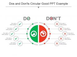
Presenting dos and donts circular good ppt example. This is a dos and donts circular good ppt example. This is a two stage process. The stages in this process are problem solution, current state future state, before after, challenges solutions, compare, comparison.
Offering bridge between current state future state PowerPoint layout. Clean and clear PPT slide with high resolution content. Easy to customize presentation model for inclusion and exclusion of data as per individual choice. Pre designed PowerPoint model for students, teachers, financial analysts and other business professionals. Personalize the slides with your company name and logo. Flexible option for conversion in PDF or JPG formats. Easy to download and save in format of your choice. Available in both Standard and Widescreen slide size.
Presenting old versus new before and after ppt template. This is a old versus new before and after ppt template. This is a two stage process. The stages in this process are problem solution, current state future state, before after, challenges solutions, compare, comparison.
Stunning current state vs future state PPT template to grab the attention of your viewers. The PPT graphic is popular and in demand due to its easy use and accessibility. Edit any number of times without any resolution change. Suitable for any need of planners, strategists, engineers, designers etc. Easy and convenient downloading by following simple steps. Fully compatible with Google. Have the tendency to enhance the overall impact of your presentation. Presented to be saved in JPEG, JPG or PDF format if required.
Presenting yesterday today tomorrow powerpoint slide inspiration. This is a yesterday today tomorrow powerpoint slide inspiration. This is a three stage process. The stages in this process are problem solution, current state future state, before after, challenges solutions, compare, comparison.
Presenting dos and donts bullet points with tick mark icon ppt slide. This is a dos and donts bullet points with tick mark icon ppt slide. This is a two stage process. The stages in this process are problem solution, current state future state, before after, challenges solutions, compare, comparison.
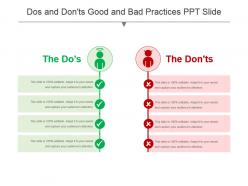
Presenting dos and donts good and bad practices ppt slide. This is a dos and donts good and bad practices ppt slide. This is a two stage process. The stages in this process are problem solution, current state future state, before after, challenges solutions, compare, comparison.
This dos and don’t PowerPoint templates is completely customizable. This PPT slide is completely editable. This template is compatible with all major Microsoft PowerPoint versions and Google Slides. You can edit the color, icons and font size as per your requirement. The PPT slideshow can be viewed in widescreen or standard size in the ratio of 16:9 and 4:3 respectively. Just download the dos and don’t PPT template and use it for your next presentation with the required changes.
Presenting start to finish status update current vs future state ppt images. This is a start to finish status update current vs future state ppt images. This is a two stage process. The stages in this process are problem solution, current state future state, before after, challenges solutions, compare, comparison.

Presenting current state future state comparison powerpoint slide deck. This is a current state future state comparison powerpoint slide deck. This is a two stage process. The stages in this process are problem solution, current state future state, before after, challenges solutions, compare, comparison.
Presenting positive and negative infographic ppt slide. This is a positive and negative infographic ppt slide. This is a two stage process. The stages in this process are plus and minus, advantages disadvantages, positive and negative.
Presenting dos and dontsthumbs up thumbs down powerpoint template. This is a dos and dontsthumbs up thumbs down powerpoint template. This is a two stage process. The stages in this process are problem solution, current state future state, before after, challenges solutions, compare, comparison.
Presenting current state vs future state bridge powerpoint slide designs download. This is a current state vs future state bridge powerpoint slide designs download. This is a two stage process. The stages in this process are problem solution, current state future state, before after, challenges solutions, compare, comparison.
Presenting dos and donts with smiley sad emoji ppt slide. This is a dos and donts with smiley sad emoji ppt slide. This is a two stage process. The stages in this process are problem solution, current state future state, before after, challenges solutions, compare, comparison.

Presenting current vs future state with world map PowerPoint slide graphics template. The PPT is professionally made by our designers which can be customized according to your requirements. You only have to replace the dummy text with your original presentation content in the space provided. Our slides can also be personalized by adding your company name and logo in it. The biggest advantage of downloading our slides is that you get to use it in both widescreen and standard screen format and either saving it in a PDF or JPG format too. The slide is fully compatible with Google Slides and can be downloaded fast at the click of a button.
Presenting dos and donts with yes no push buttons powerpoint templates. This is a dos and donts with yes no push buttons powerpoint templates. This is a two stage process. The stages in this process are problem solution, current state future state, before after, challenges solutions, compare, comparison.
Presenting current state future state line graph powerpoint slide deck template. This is a current state future state line graph powerpoint slide deck template. This is a two stage process. The stages in this process are problem solution, current state future state, before after, challenges solutions, compare, comparison.
Presenting current state future state steps powerpoint slide. This is a current state future state steps powerpoint slide. This is a two stage process. The stages in this process are problem solution, current state future state, before after, challenges solutions, compare, comparison.
Presenting past present future road with arrow powerpoint slide images. This is a past present future road with arrow powerpoint slide images. This is a three stage process. The stages in this process are problem solution, current state future state, before after, challenges solutions, compare, comparison.
Presenting problem and solution powerpoint template. This is a problem and solution powerpoint template. This is a two stage process. The stages in this process are problem solution, current state future state, before after, challenges solutions, compare, comparison.
Presenting positive and negative thumbs up thumbs down ppt slide. This is a positive and negative thumbs up thumbs down ppt slide. This is a two stage process. The stages in this process are plus and minus, advantages disadvantages, positive and negative.
Presenting dos and donts with thumbs up thumbs down icon ppt icon. This is a dos and donts with thumbs up thumbs down icon ppt icon. This is a two stage process. The stages in this process are problem solution, current state future state, before after, challenges solutions, compare, comparison.
Presenting positive and negative assessment bullet example of ppt. This is a positive and negative assessment bullet example of ppt. This is a two stage process. The stages in this process are plus and minus, advantages disadvantages, positive and negative.
Bringing Dos And Don’ts Of Marketing PPT Slide. The template is available in PowerPoint and is suitable for use in Google Slides too. The slide is available in two variant ratios – 4:3 and 16:9. We ensure highest standards of quality are maintained. The slide can be edited as per your requirement. You can change the color of the background. You can replace the sample text with your own content. The font style, size and colors can be changed according to your needs. You can insert the company name and logo conveniently. It can be downloaded easily.
Presenting past present future ppt slide. This is a past present future ppt slide. This is a two stage process. The stages in this process are problem solution, current state future state, before after, challenges solutions, compare, comparison.
Presenting positive and negative symbol with bullet ppt example. This is a positive and negative symbol with bullet ppt example. This is a two stage process. The stages in this process are plus and minus, advantages disadvantages, positive and negative.
Presenting current state and future state comparison communication ppt design. This is a current state and future state comparison communication ppt design. This is a two stage process. The stages in this process are problem solution, current state future state, before after, challenges solutions, compare, comparison.
Presenting positive and negative feedback report infographic ppt design. This is a positive and negative feedback report infographic ppt design. This is a two stage process. The stages in this process are plus and minus, advantages disadvantages, positive and negative.
Presenting Dos And Don’ts Presentation Diagram PowerPoint slide. It is available in PowerPoint and is in sync with Google Slides too. The layout can be customized. You can add your content in the text holders provided, the company name and logo can be adjusted in the slide too. It is available in two variant aspect ratios – 4:3 and 16:9. The high resolution of the image ensures good quality. It can be downloaded at the ease of a click!
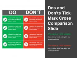
Bringing this Dos And Don’ts Tick Mark Cross Comparison Slide. The slide is in PowerPoint and is suitable for use in Google Slides also. The template can be edited. You can add your own content and change the font style, size and color. You can also insert your company’s name and logo. It is available in two variant aspect ratios – 4:3 and 16:9. It can be downloaded at a click!
Presenting positive and negative assessment document sample of ppt. This is a positive and negative assessment document sample of ppt. This is a two stage process. The stages in this process are plus and minus, advantages disadvantages, positive and negative.
Introducing gap analysis source and recommendation PPT slide. This is prodigiously devised PPT template expounding about the significance of organizational structure for the business. The Presentation design, verse, themes, figures, etc. are totally amend able. This is also quite feasible for business experts, business management. This Presentation graphic can be easily adaptable with the Google Slides and can be exportable into PDF or JPG formats.

Presenting before versus after template picture polaroids powerpoint presentation. This is a before versus after template picture polaroids powerpoint presentation. This is a two stage process. The stages in this process are problem solution, current state future state, before after, challenges solutions, compare, comparison.
Stunning before and after PowerPoint diagram PPT template. Presentation slides can be viewed in standard and widescreen view. Fast to download, share and insert in the presentation. PowerPoint designs goes well with Google Slides. They provide high-quality performance. They have time-saving abilities. Convertible into Jpeg and Pdf document. Add logo, image and icon as per the requirement. Suitable for business leaders and managers. Awesome slides which attract the attention of the audience with realistic approach towards time.

Striking before and after PowerPoint slide layout PPT template. High quality visuals and colors. Presentable and easy to comprehend visual graphic. The presentation template can be downloaded and saved in any desired format. Valuable for the business presenters and entrepreneurs as they can showcase their business success in a creative way. Privilege of insertion of logo and trademarks for more personalization. Adaptable to wide screen view without the problem of pixilation. Can be used with Google Slides.
Presenting to you a slide on “Dos And Donts Of Content Writing List PowerPoint Shapes”. It is accessible in standard and widescreen view. All the instructions are given to easily edit the slides. Insertion of logo, icon and image can be done with ease as per the requirement. The various shapes in the timeline presentation template can be customized or changed according to your preference. Various options of icons are given on every topic which can be used with ease. The presentation slide is fully compatible with Google Slides and can be viewed in formats such as PDF and JPEG. Make the most of it and enjoy the wonderful presentation.
Introducing our premium set of slides with Dos And Donts For Social Media Marketing. Ellicudate the two stages and present information using this PPT slide. This is a completely adaptable PowerPoint template design that can be used to interpret topics like Post Frequently, Always Sell, Value Feedback, Annoy Your Audience, Message Should Be Short And Clear, Create Personal Touch With Audience. So download instantly and tailor it with your information.
Present your slideshows with our high-quality graphics current state vs. future state image and text PowerPoint slide designs. The PPT is fully customizable. You can change the icons, colors, text and image of the template as per the instruction guidelines provided. Option to add your company name and logo is also provided. It can be saved and viewed in multiple formats. Google Slides are also compatible with it. You can easily replace the dummy content with the presentation content and present the slideshow within few minutes. Downloading and sharing is quick and hassle free.
Presenting Dos And Don’ts Vector PowerPoint Slide Template. The slide is available in wide and standard screen sizes. It is fully editable in PowerPoint and is suitable for Google Slides as well. The presentation’s content along with the company’s name and logo can be added easily. The color of the background can be altered too. It can be downloaded easily.
Presenting before after industrial growth ppt slide. This is a before after industrial growth ppt slide. This is a two stage process. The stages in this process are problem solution, current state future state, before after, challenges solutions, compare, comparison.

Presenting before versus after slide with market powerpoint layout. This is a before versus after slide with market powerpoint layout. This is a two stage process. The stages in this process are problem solution, current state future state, before after, challenges solutions, compare, comparison.
Presenting dos and donts with right wrong icon powerpoint slides design. This is a dos and donts with right wrong icon powerpoint slides design. This is a two stage process. The stages in this process are problem solution, current state future state, before after, challenges solutions, compare, comparison.
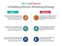
Introducing our premium set of slides with Dos And Donts Of Building Effective Marketing Strategy. Ellicudate the two stages and present information using this PPT slide. This is a completely adaptable PowerPoint template design that can be used to interpret topics like Do Evaluate Your Target Audience And Plan Your Strategy Around Them, Do Review Your Website Regularly And Implement The Required Updates. So download instantly and tailor it with your information.
Presenting gap analysis action plan target and progress PowerPoint guide slideshow which is 100% editable. This PPT template is crafted with attractive display and unique components. This PPT slide is easy to customize and enables you to personalize it as per your own criteria. The presentation slide is fully compatible with Google slides, multiple format and software options. In case of any assistance, kindly take instructions from our presentation design services and it is easy to download in a very short span of time. The images, layouts, designs are of high quality and ensures quality in widescreen.
Presenting current state and future state sample slide. This is a current state and future state sample slide. This is a two stage process. The stages in this process are problem solution, current state future state, before after, challenges solutions, compare, comparison.
Item 1 to 60 of 137 total items
- You're currently reading page 1

Ratings and Reviews
by Dewey Stephens
June 14, 2021
by Walsh Turner
June 15, 2021
by Dominique Vazquez
by Dee Hicks
by Derek Mills
by Thomas Carter
by Chauncey Ramos
by Cristopher Cole
June 16, 2021
by Daniel Mcdonald
Items 1 to 10 of 127 total

- Presentation Collections
How to Create a Timeline in PowerPoint? Step-by-Step Methods?
Now, the timeline in PowerPoint is indeed valuable if you have to organize data quickly and present it in a way that your audience will understand. Whether you are working on a business proposal, following up on a project, or just looking to point out some historical events, it can make things simple by making the data fit into a clear visual image. But how do you do this? Don’t worry, as it’s much easier than you might think. And that is just what I am here to walk you through.
Timelines are always powerful in the corporate world, education, or personal projects. PowerPoint offers you a flexible platform where you can create timeline slides that not only function great but are crafted in a great UI. In this step-by-step guide, learn how to create a timeline in PowerPoint.
Why Have a Timeline in PowerPoint?
Ever tried to describe a series of events without having something visual in front of you? It’s a bit like navigating a new city without a map. Timelines make crystal clear the linearity of events, and therefore, it becomes pretty easy for your audience to follow a timeline. Besides, a brilliant design of the timeline will make your presentation outstanding and keep your audience interested.
Choosing the Right Timeline PPT Template
The other thing you need to consider is choosing the right template before creating your timeline. PowerPoint has thousands of different timeline PPT templates at your service, all serving varied needs. From a very simple and clean template to a more detailed one, picking the right template will save you hours of work in the long run and set a tone for your entire presentation.
Clean Templates: Suitable for professional, clean presentations.
Storytelling Templates: Suitable if you are in a creative industry.
Project Management Templates: Great to represent your project milestones and deadlines.
Step-by-Step on How to Make Timeline
Building a timeline in PowerPoint is easy, seamless, and—without making a tall claim—a lot of fun. Here is what you need to do:
Open PowerPoint and open a new slide where you need to create a timeline
In the toolbar, click “Insert,” and then “SmartArt.”
Click “Process” in SmartArt. Here is where one can select, under “Process,” the style he/she wants or change the order of the elements. There are numerous SmartArt choices in here for processes. Select one you like, keeping in mind you need to create a timeline.
Click in the timeline graphic text placeholders to you enter your information.
Drag timeline elements to size and space the layout as needed.
Customizing Your Timeline
One of the real strengths of PowerPoint is its customizability. You can shape your timeline to suit your brand or taste. Here’s how:
Change Colors: Change to different colors that match your brand or theme by using the “Format” tab.
Change Fonts: Make sure your fonts match other slide content.
Resize shapes: Drag some of your elements to re-size them so that nothing is over-flown from your slide.
Milestones and Events
These are the main activities of the timeline. This can be when your project is due at a significant time in history or even personal accomplishments for that matter.
Click on the timeline to add new milestones or events
Ensure that every milestone is clearly labeled to let the audience know what it represents.
Visualization by icons or symbols will help set different milestones apart.
Adding Visual Elements
Visual elements enhance readability and the feel of a timeline. Follow these steps to add them:
Images: Add images relevant to the events or milestones being represented.
Icons: Add icons that describe what kind of events or actions were made for them.
Shapes: Add shapes to add a background to your timeline or to draw attention to some sections.
Best Practices while building a timeline
While building a timeline, ensure that you adhere to the best practices
Keep it Simple: Don’t put too much on your timeline.
Consistent Spacing: The space between milestones must be consistent
Key Events The key events should pop up. The color or size should be different to help the viewer see what’s what.
Common Mistake
It’s easy to fall into some of the typical pitfalls when working on a timeline. Here are a few to be on the lookout for:
Information Overload: More information is overwhelming to your audience.
Design Inconsistency: Keep a consistent look with color, font, and layout.
Forget Scale: Make sure the timeline represents the timeline intervals between the events.
Animating for Effect
Bring your timeline to life by adding some great animations. This is how you do it:
Animate Your Milestones: In the “Animations” tab you can see how to animate each of your milestones within your timeline.
Chronologize Them: Determine the proper chronology of animations so that your events appear in the chronology in which they happened.
Subtle Animations: They shouldn’t be too flashy, though. They should be subtle to not be overwhelming and take away from the content.
Saving and Sharing Your Timeline
Now that you have composed your timeline, it is time to save and share it. PowerPoint has some options for this:
Save as PDF: This is great for distributing your timeline on its own, like sending it via e-mail or distributing it in a handout.
Export as Image: This will save the timeline as an image so you can use it within another document or on the web.
Share from PowerPoint You can share your file from PowerPoint via email or cloud services.
Who said building a timeline in PowerPoint was supposed to be difficult? With the right template and some basic steps, you can present a timeline that pops up. A student, professional, or anyone who needs to visualize any information truly needs PowerPoint timelines because of just how versatile of a tool it is—you’ll use it over and over again.
1. Can I use a timeline ppt template for personal projects?
Yes. Timeline templates may be used in tracking personal goals, event planning, and anything else.
2. How do I make my timeline more interesting?
Display visuals in the form of images, icons, and subtle animations to serve further the desire of the audience.
3. How do you make a PowerPoint timeline without using a timeline template?
Of course, you could do all that manually with shapes and lines, but this template would let you do it much quicker, and it also makes sure that your timeline will follow a clear structure.
4. How do I share my timeline with others?
Save your timeline as a PDF or image, and then share your file just by sharing your PowerPoint file.
5. How do I update my timeline to include other events?
Just open your PowerPoint file and click on the top of the timeline to add or edit any milestones you would like back.
Spread Love
Related blogs.

Jerom is a presentation content strategist with over three years of experience writing engaging content and has worked in different niches. He has a strong background in PowerPoint and Excel, so he has learned how to compact complex ideas into simple, clean design visuals in slides. He loves teaching and is always ready to share his tips and ideas on mastering PowerPoint.
Recent Blogs

How to use Google Slides offline and Work Anywhere?
Google Slides is equally a perfect tool that can be used in the creation and sharing of presentations. Use is...

How To Make A Graph In Google Slides
Google Slides is a powerful tool for creating presentations, but it also offers a variety of features for visualizing data....

Easy Ways to Show Multiple Project Status Using Presentation
Navigating multiple project report status can be frightening. Simple presentation tips with possible tactics can help you sort out. Simplify...
SIGNUP FOR NEWSLETTER

IMAGES
VIDEO
COMMENTS
There you have it - 16 PowerPoint dos and don'ts for creating memorable, professional PowerPoint presentations. Apply the dos to make high-impact slides, and avoid the don'ts for mistake-free presentations. Put these PowerPoint best practices into play and watch your ordinary slides transform into extraordinary visual stories.
7. Add graphics and videos. One benefit PowerPoint provides as a visual aid for presentations is the ability to embed multimedia elements. Adding graphics or videos to your slides can make them more visually appealing and also provide important information.
PowerPoint DON'TS. DON'T read from your slides. One of the most common mistakes presenters make when using a PowerPoint is treating it like a script and reading every word. This will make your presentation boring and unengaging. 2.DON'T use distracting animations. Many presenters are tempted to use animations and transitions to add a fun ...
10. End with a summary slide. It's a good case practice to go through your key points and list the final benefits in a summary slide, at the end of your presentation. The most important sections of your presentation are the beginning and ending. The beginning is when you will grab the attention of the audience.
8 Do's And 8 Don'ts Of PowerPoint Presentations When it comes to the do's and don'ts of designing PowerPoint presentations, understanding the key elements can make all the difference. Whether you're aiming to inform, persuade, or engage, the way you design your slides plays a pivotal role in how your message is received.
Take a pause after you ask a question or make a strong statement. Spare your audience a moment to think, reflect, and ponder. Or leave a gap of silence right before you present something exciting to build suspense and anticipation. No one expects you to go on talking for 10-15 minutes without a pause.
DO: Stay Concise. The biggest rookie PowerPoint mistake is to copy and paste all your information verbatim into the slides. Not only is this incredibly boring, but no one is going to have the time or inclination to read a wall of text. Don't turn a presentation into a book. There's no hard rule, but a good general ...
Presentation Don'ts 1. Don't Use Too Much Text. You're not writing a book — your slides are meant to be observed for several seconds with minimal effort from the viewer. You have a limited hold on your audience's attention. Don't risk being boring via information overload and keep text at a minimum.
DO: Keep it Concise. The biggest mistake most people make when creating a slideshow is to paste all of their information verbatim onto the slides. Not only is this incredibly boring, but no one has the desire to read all of that text. The general rule of thumb is to limit yourself to five words per line and no more than five lines per slide.Â.
Pro tip - never read word for word from your slide. 6. Keep your slides consistent and ensure that the branding matches across the entire presentation. Pro tip: Your first and last slide should be the strongest. This is because you need a captivating introduction to draw people in and keep them curious, and you want to end with a strong ...
The Don'ts. Ineffective Slides and Visuals. Poorly prepared slides can ruin a good PowerPoint presentation, so it is worth the time and effort in getting your slides right. The most effective presentation visuals do not have to be flashy, they just have to be brief and consistent.
Effectiveness of verbal communication in PowerPoint presentation: Along with the dos and don'ts of ppt design, here are some key points to consider for enhancing the effectiveness of verbal communication during a PowerPoint presentation: Clarity and Enunciation: Speak clearly and enunciate your words to ensure your audience understands you ...
In this video, I shared 10 powerpoint presentation tips; 5 Dos and Don'ts that will make your presentation slides better. These powerpoint tips and tricks ar...
6. Reading from the PowerPoint. Don't do this. It makes you redundant and superfluous. Think about when when your students a PowerPoint presentation as an assignment. What is it like when they present by simply reading what they wrote on each slide. Awful. I have to assume you don't need the notes on the slides as a cheat sheet.
In this video series a range of tips and tricks to improve a PowerPoint presentations are demonstrated. This video briefly covers a great selection of Do's a...
PowerPoint presentations can be daunting, but these dos and don'ts make it less intimidating. May 25, 2020 Using PowerPoint effectively is a skill, and this article provides valuable dos and don'ts.
11 "Do's" for Giving a Great Presentation. 1. Believe that giving a great presentation is a learnable skill. Giving a good presentation is a learnable skill. Even true introverts can give excellent presentations. In fact, introverted people actually tend to plan better presentations though they may be more afraid to give them.
7. Use vibrant colors. A striking contrast between words, graphics, and the background can be very effective in conveying both a message and an emotion. 8. Import other images and graphics. Don't limit your presentation to what is offered.
8. Can help keep you on topic and moving at a steady pace. Usually easier to read than overheads. Relatively simple to insert things like links, audio files. Easier to project figures than recreate them on the chalkboard. Can paste in slides from previous lectures to transition between topics or review concepts.
Free Dos And Donts Presentation Templates. Teach both do's and don'ts with our pre-made, editable Free Dos and donts PowerPoint Templates and Google Slides Themes, effective tools for comparing topics. It includes checklists to show what's right and helps to highlight key points with bright colors and eye-catching icons.
The Free Do's and Don'ts PowerPoint Template is a presentation tool for comparison topics. These are two free slides of PowerPoint with four and five rows comparison presentation to choose from. This template is designed to display the do's and don'ts of any project or process. For example, mistakes which should not be repeated or the ...
Presenting Dos And Don'ts Presentation Diagram PowerPoint slide. It is available in PowerPoint and is in sync with Google Slides too. The layout can be customized. You can add your content in the text holders provided, the company name and logo can be adjusted in the slide too. It is available in two variant aspect ratios - 4:3 and 16:9.
PowerPoint has thousands of different timeline PPT templates at your service, all serving varied needs. From a very simple and clean template to a more detailed one, picking the right template will save you hours of work in the long run and set a tone for your entire presentation. Clean Templates: Suitable for professional, clean presentations.